Tuesday, April 13, 2010

Hornbook Production Part 2.


This is the completed Forme. There were several edits, one 'd' was inserted upside down, a few coppers had to be inserted into one of the 'Criss Crosses' to enable a tight lock-up. Oh, heh, yeah, I forgot one of the letters of the alphabet. Figures.


This is the chase lock-up. You cannot tighten the lock-up too much or too little. Two little and the forme spills, and you have a very frustrating pied pile under the press . . . in the oil. Too tight, and you can potentially warp your chase such that it cannot rest level against the press' type bed. BTW, you Kelsey aficionados: notice what I am using as an imposing surface for my 8x12 chases? None other than the type bed of a 9x13 Kelsey. Best portable imposing "stone" I've ever had. And the rails serve as convenient handles!


Here is the progress in mid-run. I have one copy laying on one of the unfinished blanks to serve as a sizer. There have been some design changes in this batch of Hornbooks to bring it nearer to it's 17th Century origins.


A closer look at the unfinished blank and print resting atop. This gives me a pretty good idea of the finished product. One consideration is the placement of the nails that hold the sheet. It cannot be too close to the edge of the wood, and must also be slightly angled inward.


There are three design changes. First, notice the Thistle border. This calls to a Scotts background.  Of course, you know that Scotland was saved from her Norse Invaders by the lowly Thistle? Actually, the ancient symbol was the bent, or broken thistle.  The second change was the addition of the crosses. This is a significant inclusion in that these "printer's crosses" were almost universally used on Hornbooks, even in Europe. These crosses were built up from the upper case letter 'I', either locked together with quads around an ornament as seen here, or mitred together. These were known as "Christ Crosses", which over the years became called the "Criss Cross". At least one appeared at the top, usually before the first letter 'A'. Many used two, bracketing the alphabet in a more pleasing symmetry. The third change is the upper case 'O', using instead a more authentic 24pt. Caslon upper case letter. As mentioned, on my last run of Hornbooks (which was my first run, produced before I had more research information) - I used an ornamental 36pt. Goudy monotyped ornamented 'O'. The letter is beautiful. But it dates to 1920. Not very colonial.

Today is printing day. I'll be running as many of these as I can. The next stage will be staining the blanks. After that, the mounting and decoupaging of each Hornbook. Then they go to the client(s).

Stay Tuned.

-gary

Q5 Studio and Pretty Good Letterpress
wd4nka@aim.com


Another Hornbook Production.


Another production run of authentic early American Hornbooks! After receiving an order for four, I decided to do an actual production run. What is a production run? Well, for one thing, it involves me putting on my woodworker's hat and locating the proper wood. Since these books typically took a student through all their early years of primary education, the wood has to be somewhat durable. But to keep costs down, I have to find a cost effective wood stock that would be both affordable for the client, yet durable for use. In a sense, in my mind's eye, I see these "books" as actually being used for their intended purpose. In this case, I traditionally use clear pine. Not construction grade, but furniture grade.


The process begins with cutting the wooden "blanks", which involves three basic processes: (1) cutting the wood into 3.5 by 8 inch squares. (2) Then running these squares through an angled table saw to notch out the handles. (3) Then sanding. What this photo shows are the blanks cut, but not filed and sanded as of yet. The sanding takes the longest time. After this, I might add a fourth procedure, that of staining the wood if called for. Sealing waits until the text is nailed to the blank, whereupon the whole is decoupaged together. Originally, animal horn was heated, separated, cut and affixed over the text with a lead frame held in place by nails. I omit the lead because these are being offered to schools. As it is, many of the samples I've seen used nails only without the frame, so either way is authentic. Animal horn is subject to decay and rot - which is why the actual 300 year old specimens that exist are almost never intact. Thus, I use a decoupage process which is safer, longer lasting, yet retains the look of antiquity. The nails used with this run are copper. Iron was used as well as brass rivets, but copper oxidizes with that ancient greenish tinge, which is classic. These will age very nicely. Especially as the wood reddens with age.


At this point of the process, I begin the composition of the text which will be eventually printed and affixed to these blanks. The font used is authentic to the era, an early 18th Century Caslon, supplied by M&H Type Foundry, San Fransisco. The type is composed in three sections, or "charges". When the composition stick fills, the type is removed and lined up on a "galley" tray. After all the charges are compiled, and are ready to be mounted into the press's chase - which is an iron frame that holds the type in place - the assemblage is called a 'Forme'.


This is the first charge. Two more to come. The tool on the left is a slug cutter, which trims leads to the proper width.


This is a photo of the blanks and the finished product which I ran back in the early 1990s when I owned and operated "Heirloom Press" out of Palm Harbor, Florida. The design on these new Hornbooks will differ slightly to incorporate the "Printer's Cross", or the "Christ Cross", which became known as the "Criss Cross". These are crosses composed of four upper case 'I's, sometimes mitred, or sometimes composed together with a centre ornament. Also, the upper case letter 'O' in the Lord's Prayer is more authentic. Formerly, I used an ATF Goudy ornamental cap from 1920. This go 'round, I'm using a 24pt Caslon Capital, of the same era as the rest of the composition. Of course I include the archaic tall 's', which looks like an 'f'. These were used prior to 1800, a throwback to the ancient blackletter types. The tall 's' was used for the letter 's' at the beginning and middle of a word, never at the end.


That's were I am now. Printing will commence on the following day. It is a complex composition which can take a long time to arrange so it holds together in the chase without spilling out. It's a skill the curve of which I still reside. All in all, these eight Hornbooks should take me about five days to produce, including the various drying times. But it is worth it.


Hornbooks represent to me not only a valuable and important part of United States History and the first Colonial Societies that laid the foundations of our representative Republican Democracy, but also a product made in the United States, made using the original and authentic processes with American materials, using vintage iron presses, using a time honoured process requiring an unusual amount of attention and care to produce a quality product. This was the Hallmark of American Industry at one time. I intend to perpetuate that legacy. Q5 Letterpress' Hornbooks will never be made in China!


That's it for now. More to come. Stay tuned!

Good Providence to you in all your endeavours!

-gary

Q5 Studio & Pretty Good Letterpress
G. Johanson, Printer

Thursday, March 25, 2010

"Old School" Designing for Letterpress


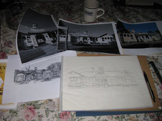
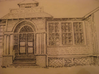
The project on the board right now is creating a scalable vector image of the main building of the Florida Pioneer Settlement for the Creative Arts. This would be used for anything from Stationery Letterhead to Name Badges to Greeting Cards. Initially I sought for line art already created. Surely in the past one hundred years of this structure's history somebody did some sort of high contrast (pen and ink, likely) rendering. But all I could find was a hopelessly re-photocopied image that was of no use for conversion to Vector.

So . . . I was on my own.

I did a photo-shoot of the place in an attempt to capture the heavily tree shaded building's very unique front and cupola without so many tree branches in the way. It was nigh unto impossible. I had to shoot images closer than my design requirements. So just shooting black and whites, running them through a Cut Line Filter or some other photoshop trick to produce tertiary shades of gray out of dots, cross hatch lines or stipples were out.

So it was up to me using some good old tools I haven't touched in years: India Ink, Paper and my trusty fine tipped Rapidograph. For those who are not familiar with the Rapidograph pen: these were commercial artists bread and butter tools at one time. They are essentially hypodermic needles with a sort of piston inside which, when pressed tip down on the drawing surface, releases a quantity of ink from a pre-loaded cartridge.


So, with these basic but time tried tools, I stepped back to 1974 when I actually made money doing these sort of things. I was a calligrapher and free lance commercial artist. My last gig was illustrating a technical handbook up in Chicago back around 1991.

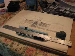
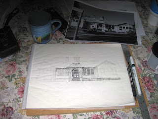
In the photo above you have tracing paper, Rapidograph pen, kneeded eraser, mechanical pencil (soft) and a cork-bottom steel rule. I won't be using Bristol Board this go-round because were not doing camera-ready art, were doing scanner ready art for vectorising.

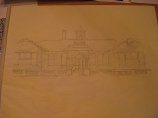
I did a direct trace of the main elements of the building. This would serve as a sort of framework for the ink fill, which will be the really time consuming part of the project.


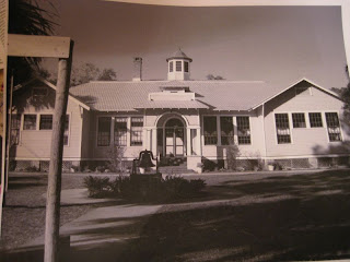
This is the photo that I used.


You can click on each photo for a larger image. So, this was Night One, laying out and tracing the image. Night Two, (tonight) was laying on the ink. I am using a combination of different strokes, primarily stipple rendering, essencially very small dots which are concentrated or spread out to give the effect of tones of grey. Not unlike half-tone dots. For some of the denser fields I make use of direct line and hatching.


Above is a close up of the rendering. So much of pen and ink drawing is simply suggesting an object rather then contour drawing of it. It's what you do not draw that matters. My technique almost omits any highlight rendering, but rather I fill the shaded areas only. This adds a dimension of "believability" to a pen and ink image.


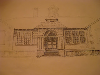
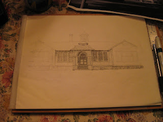
Above is what I managed tonight. About 40% of the ink is laid down. About four hours worth of work, plus one pot of coffee. The final two shots below are just other perspectives of the same thing.


I am largely sharing these just to let folks know - in case they are interested and wondering - that good old fashioned hand rendering on artboard or Bristol board with india ink is still alive and well . . . at least at Q5 Studio and Pretty Good Letterpress, anyway. Another reason is to give you a peak into a little bit of how we "did it" in the past, as far as copy work prepared before the Computer Era. Of course, I use digital techniques as well, it's a great tool. But sometimes it just pays to grab a pen and "do it yourself". Keeps you in practice, too.

I may add one more note for those of you who think that computers have rubbed you out of relativity. I met a man who runs a company here in Central Florida, who designs props for Hollywood, specifically Steven Spielberg. He hires designers. He told me that before he hires a "graphic artist" that knows everything about Illustrator and In Design and Quark or FreeHand, he first sets them down at a drawing board and has them render - by hand - something. If they can't draw, he doesn't hire them, MFA or not! He told me that it starts with the hand and eye. If you can't design with the hand and eye using basic tools on paper, you will be lacking if you depend on the computer to make up for the deficit. So chin-up, fellow Old School Rapido-jockeys! There is need for you yet!

I will continue posting the progress on this project, all the way through the finished piece, doing the vector work (fingers crossed), sending the digital off to the Platers and receiving and running the final project.

Stay tuned!

-gary

Tuesday, March 23, 2010

Behind the 7x11 Pearl OS Model 3


This installment is specifically to provide some details of the Pearl for a Fellow Printer who is in the process of restoring a Pearl. What you will see is the rear mechanism. On the back of the roller casting there is a lever upon which the base of the pawl shaft rests upon. It acts as a sort of cam which moves the pawl shaft foward. This in turn moves the pawl up, engages the ratchet teeth at the base of the ink disk, rotating it about one degree.

My Aussie Blue Heeler will serenade you as we go along. She hates it when I'm in the shop and she's not.


Here are some still shots, including one with the ink disk removed. Also, as a note, the only place that a spring is located on my press is the chase clamp. It anchors to the neck casting with receives the ink disk.


I hope these images are helpful, Rachel.

Good Providence in all your Letterpress endeavours!

-gary

Q5 Studio and Pretty Good Letterpress


Tuesday, March 16, 2010

Q5 Studios Resurrects the QSL Postal Label


Ok, so I have way too much time on my day off, apparently. I spent a good part of the day designing the tee-shirt for the Central Florida Pregnancy Center's "Walk for Life". As long as I had FreeHand up and running, why not see what we can do with that frame I made up for Q5 Studio.

So, what's a QSL? Firstly, "QSL" is the International Code signal for "Confirmation of Receipt of Message". In other words "Yeah, I heard ya". Now, the thing you must know about Radio History is that from the beginning, wireless communications was a grass-roots thing. Yes, it's true that Marconi had the British Navy equipped with wireless by 1898 and managed to sneak the letter "S" across the Atlantic in 1903. But all during this time, wireless circuits had been published and copied by Hobbyists the world over. In fact these "Amateurs" began to organise, and by the time the Titanic went down, Amateur Radio was firmly rooted, with the U.S. Dept. of the Navy issuing code endorsements. Amateur Wireless operators began to establish themselves on the cutting edge of radio technology, and by the time of the closing of the First World War became seen as an important public service.

As equipment improved - largely due to developments by Hams - so did distances wireless signals could both travel, and be heard. As standard radio frequency allocations placed Amateurs on what became known as the Short Waves, Continental and International communications became not only possible, but eventually - common place.

When one station contacted another station, it became a tradition to send a Post Card confirming the contact. These cards contained information regarding time and date of contact, the frequency used, the condition of the signal, the equipment used, and maybe some personal comments and greeting. These became known as "QSL Cards", and date as far back as the first decade of the 20th Century.


Most of the early QSL cards were printed by Letterpress. Sometimes a standard post card was used with the addition of a special QSL Label. As international trading of QSL cards began to become voluminous, QSL "Bureaus" were organised as a central collection and re-distribution point. Hams would subscribe to these Bureaus which could be a Radio Club sponsored endeavour or a National Organisation operation such as the American Radio Relay League, the roots of which go back to 1914. QSL stamps were often affixed to the envelopes that contained QSL cards sent out to recipients. Thus we have privately produced QSL Labels - or Stamps - being utilised by both private radio stations, commercial stations, QSL Bureaus and Wireless Organisations.

There were other para-postal ephemera that found their way onto the mails. The Ham Radio version of the Telegramme is the Radiogramme, which at one point in time was one of the fastest ways of getting communication in or out of any region. Disaster areas in particular. Radiogrammes were typed up on special stationery, and were usually hand delivered to the recipient. Sometimes a label may have been affixed, corresponding to the old Telegraph Receipt and Commutation stamps of the 19th Century. I've seen only one in the flesh, myself. Heh, in fact, it may have been mine. Oh well . . . .

Shortwave Listeners - who were not licensed Amateurs in that their hobby involved only listening and logging the signals they could pull out of the Ether with their usually hand-made receivers - would send reception reports to Short Wave stations and receive in return a QSL Card from the commercial (or otherwise) station in return. At one point, Domestic and some foreign broadcast stations issued "EKKO" stamps. These were beautifully engraved designs executed by the American Banknote Company - a company that at one time produced regular postal issues for the United States Post Office Department.


This particular specimen is typographed. Letterpress Printed.


This is and example of an EKKO stamp. Both of these come from Fort Wayne's "WOWO". When the sun goes down you can still hear this Clear Channel powerhouse just about anywhere east of the Mississippi. Brings back a lot of memories.


Ok, one more design from Q5. See those wires on the ship? This was wireless in the heyday of Spark, when a radio signal sounded like a medium-pitched buzz sent at a code cadence. Some of these big bruisers ran several Kilowatts of raw spark. Talk about ozone! When Debernet et Cie. engraved this center cut in 1910, a radioman's position was a guaranteed Officers Commission. They used to call him "Sparks".

That's all for today. Another eccentric post and another piece of oddball history.
Welcome to my world.

Good providence in all your endeavours, and give a listen on the old AM Broadcast band one clear night. You might find yourself unexpectedly entertained. And hooked!

-gary

G. Johanson, Printer
Q5 Studios and Pretty Good Letterpress


Monday, March 15, 2010

The American Colonial Hornbook


"In 1647 the Massachusetts government passed a law requiring that all towns except very small ones must provide schools for the children. This was the first law of its kind passed in the colonies or in Europe. The law began by stating that in the past it had been 'one chief point of that old deluder, Satan, to keep men from a knowledge of Scriptures . . . by keeping them in an unknown tongue . . .' To encourage reading and to prevent learning from 'being buried in the grave of our fathers', the Massachusetts ['Old Deluder Law'] ordered: 1 - That every town having fifty householders or more should at once appoint a teacher of reading and writing and pay him out of town funds, and 2 - That every town having one hundred householders or more must provide a school good enough to prepare young men for entering a college or pay a penalty for failure to do so."

(Rise of the American Nation, 2nd Ed., Lewis P. Todd & Merle Curit, Publ: Harcourt, Brace, World, (c) 1966 . vid page 80.)

The Massachusetts Bay Colony was simply carrying on an Old World tradition. The "entry" years of education always involved "reading, writing, and cyphering". Over the years, simple visual aids had been developed to assist in these basic elements of primary education. Even during the Dark Ages, a simple condensation of Alphabet, Cypher, Phonetics and Scripture (which provided the main impetus for literacy in Europe) was used as the first introduction to literacy. Engraved in soft metals, wood, ivory, vellum, later printed on paper and mounted on wood, these visual aids served as the first text "books" for formal education. By the 1600's, the most popular of these items were the "chap book", and what we are focusing on now, the "Hornbook".

The traditional form of the Hornbook resembles a small paddle, no doubt helpful to the teachers. After the introduction of printing, the local printer would set the alphabet, upper and lower case, simple phonetic exercises, and then scripture. Usually the "Lord's Prayer" was used. The term "Hornbook" derives from the covering used to shield the printed text on paper from the elements. The artisan would take horn from the animal and heat it until it became pliable. Horn has somewhat a laminate property, and under heat horn "layers" can be stripped into thin sheets. These in turn were cut to size and mounted over the printed text upon the broad, flat area of the "paddle". Some examples still retain the leaden "frame" that was often used to secure the horn and paper to the board. Over the years the horn rotted away. I have not seen any examples of Hornbooks which still has the horn intact.

Often, a Cross appeared in the upper left hand corner of the page. This is nicknamed the "Criss-Cross" or 'Christ Cross'. Some called it the Printers Cross, made from four mitred capital "I"s. It must be remembered that for many hundreds of years it was the Church that sponsored any sort of public education, hence the Biblical emphasis. This carried over to the Colonies, where a formal education was highly valued by Puritans, Congregationalists, German Lutherans and Swiss Brethren followers of Jacob Amman (the Amish) or the Dunkers and Schwenkfelders. Some of the old German publications in my collection mention the fear of having Civilisation dying with them in the deep dark woods of "Pennsylvanien". These groups were the founders of American Public Education. Literacy enables Freedom and secures the blessings of Liberty.

When my daughter began her schooling, I thought it might be neat to make a Hornbook for her, especially since I had a small Letterpress shop with a larger Iron Handpress, a front lever Kelsey 9x13. So following the model I had, which was a photograph of one of the 1600's era Bay Colony types, I made a number of them, most of which by now have been handed off. One is on display at the Florida Pioneer Settlement. I kept two myself, which I use in the following photos which shows different perspectives of my own version.


My Hornbooks are made with either Clear Pine, Red Oak or Poplar. They measure three and one-half inches in width, and eight inches from top to the bottom of the handle. These particular examples were printed on hand made paper, held in place by iron tacks. Instead of using horn, which really isn't a good idea, I take advantage of Decoupage, which not only seals the printed page to the wood, but also seals the wood itself. It will not deteriorate like Horn will, yet retains a sort of "vintage" lustre. The pages are hand printed using a font which was in common use during the time in which many of these Hornbooks would have been used.


Here is a closeup of the top part of the Hornbook page. What amazes me is how practical these fore-runners to School Textbooks really were. I was able to teach my daughter from just what you see right here! And just what was the quality of elementary education in 1730? Anyone who collects children's texts from the past two hundred years can tell you: very high. My wife, who possesses a Masters Degree in Education has described my Childrens Botany Textbook for twelve year old readers as absolutely college level today. The depth of thought, the level in which the language is handled, an amazingly high level for pre-teens. Perhaps they had more focus due to less distraction than we today? Southern General Thomas Jackson funded a school to teach children of slaves to read and write in the early 1860s. Yes, that's right, Stonewall Jackson. His sister was a teacher. Apparently a lot of high money friends contributed to provide a very high level of education.

Funny how they don't teach this in modern Public School History. Maybe we need Mrs. Jackson to teach today?


The above photo shows one of my pine Hornbooks stained with a Walnut stain. Sometimes the ends of the handles are drilled out to receive a leather strap. For those who were interested in the Hornbooks I make, I can provide a recess on the back to make it possible to hang these on a wall for display.


As you can see, I have a "Colonial Room" which houses my photo and part of my book collection. The Hornbooks are right at home here, although in reality their place is in the Living room entertainment unit next to my maple woodcut of a 16th century village which I cut at the same time I made these Hornbooks. That photo on the left? An 1849 mirror daguerreotype still in it's original gilt hinged folding frame. I have some 1860's tintypes behind it, and some of my school textbook collection is on the right. The desk is a hand made pine "spinet".

The subject of Hornbooks is very interesting, and you can learn a lot just perusing the internet or your local library (please support your local library! No firewall needed to read a book!) And if anyone is interested, I am planning to produce Hornbooks again. As far as I know, there are not many producers of these historical items using authentic means and authentic methods. All of my Hornbooks are hand cut, hand printed from handset type onto either handmade rag-stock paper or lignin free natural fibre papers that do not require trees to fall. For printing, I use one of two platen presses, either my C&P or my 1870's era Pearl Old Style Model 3.

If you are interested in obtaining one of my Hornbooks, drop me an e-Mail at:
wd4nka@aim.com

Or write - that's right, pen and ink (or typewriter or word processor) to:

Gary Johanson
Q5 Studio and Pretty Good Letterpress
1125 Elgrove Drive
Deltona, Florida, 32725.


That's it for this installment. Good Providence in all your endeavours!

I remain you most obedient servant
G. Johanson, Printer


Tuesday, March 2, 2010

Philatelic Art : More designs


Adding to the prior post, here are a few other designs inspired by Philately. These are called "Cutsquares", after the old method of collecting envelope stamps by literally cutting them out of the envelope (cringe!) leaving a quarter-inch margin all around them. If anyone out there still collects postal stationery, please please please leave the whole postal card or envelope intact! They will be far more interesting and the value will be maximised. And most of all, you will be preserving a bit more of a quickly disappearing history!


These "essays" are based on the designs of George Reay, namesake of his publishing firm that won the contract to produce postal stationery for the United States Post Office Department for four years, 1870 - 74. He hired the most skilled engravers he could find internationally, and the designs executed were so precision and so marvellous to behold that the Reay covers are called "Cameos". George lost the contract in 1875 to the Plimpton Publishing Company, who for several years could only print poor imitations of the Reay stamps. It got so bad that the USPOD ordered George to turn over his dies to Plimpton. He feigned in so doing, but actually gave the real dies to his wife with instructions to crack each plate and toss them overboard from the Staten Island Ferry. George died soon thereafter. It took Plimpton almost 12 years, three consecutive contracts, to catch up to Reay's quality and precision. Has anyone ever recovered those dies? No. They were copper, and more than likely gone to the elements.


The top photo was intended for Radio QSL Card stationery. These are aimed at Amateurs who like vintage, still use old style Radiograms typed from Remingtons and pound brass from a Bug. They like old style QSL cards and B&W photos of their stations equipped with racks of "Boat Anchors". Design adapted from the Reay 2c issue, 1871. Washington's silhouette is not embossed in detail. Just the white outline is seen. The idea is to suggest, not perfectly reproduce. Besides, George is probably already doing three-sixties at me borrowing his designs at all!

The second design is an adaptation of a Reay frame and "Columbia", redrawn from the 1875 Post Card design. She's Columbia, although her tiara says "Liberty". She borrowed it.


The third photo shows the Reay frame with an ATF cut of Athena (I think) in reversal. She was vectored directly from the 1915 ATF specimen book.

That's it for now. Believe it or not, there's more. I have some multi-colour Christmas Seals adapted from the 1933 designs on the drawing board, too. That's for another time.

Good Providence in all your Letterpress Endeavours!

-gary / Q5.