It all starts with artwork. Either I do the artwork or the client. Or the designer hired by the client. The artwork must be high-contrast black and white line art, that is, no tonal shading, unless rendered in a high contrast manner, such as cross hatching or stipple shading. Although I do not recommend it, half-tone photos can work, but Letterpress is not the best venue for photo reproduction.
The artwork is scanned as a black and white image, high contrast, usually around 600 dpi, although I sometimes take the image to 1200 dpi.
After the scan, I bring the resulting .bmp image up in - of all things - Microsoft Paint. Yessir, good ol' Paint is still one of the best raster level editing programs around for cleaning up high contrast black and white copy for preparation of the next step, which is to take this image and reproduce it in a vector format.
Let's pause for a moment and discuss why this is done. Years ago when the earth was still cooling, finished artwork was photographed, the negatives of which were then placed over a printing surface which was prepared with a photo sensitized coating. Ultraviolet radiation exposed this surface through the negative to create a positive image which was then developed, or in the case of a letterpress plate such as zinc, immersed in an acid bath that etched away all non-exposed surfaces, leaving the exposed which is now a raised surface owing to the etching process. In the case of offset plates, the surface is coated with a developing chemical which adhered to the exposed areas of the plate and coated these areas with an ink-adhering surface. Correpsondingly, in the case of 'subtractive plates', the chemistry washed away the unexposed surface leaving an ink-adhering surface.
In either case, the point was that a photographic process was used. If you wanted an image only half the size of the original, you just positioned the artwork twice as far away from the camera lens which reduced the size of the image. If you wanted only one quarter the original size, you moved the image 75% further from the camera lens, which we called a 75% reduction. The image was exactly the same as the 100% image, only smaller. And, inversely, if you wanted an enlargement, you could bring the artwork closer to the camera's 'taking lens'. This process was in place for over a century. In fact, my favorite camera to use was a 1922 R&R Robinson 24x24 inch mechanical camera. And yes, this was my job in the early 1970s. I shot line images and half-tones for my employer at BKM Press, and for other local magazines (as well as stripping, paste-up, and running our shop's only Letterpress.)
In today's digital world, we use a different process: digital imagery. We either use high dpi images (dot per inch) which will hold enlargement or reduction to some degree, or we use Vector images. The nice thing about vector images is that the line is actually plotted on your computer using a mathematical algorithm. In theory, you should be able to greatly enlarge or reduce a vector image because we are not enlarging or reducing an image based upon individual pixels, which can (and will) distort a re-sized image unless there are so many pixels per inch that the image will retain it's integrity. There are also filters that will help keep pixel distortion effects to a minimum. You can use a bitmapped image, but the files are (a) huge, and (b), the amount of room you have to enlarge or reduce can be quite limited. Many designers will use direct Photoshop pixel images, but for me, with a photographic background, naturally tend to go with a process that most resembles what went on when viewed through the ground glass of a 24x24 mechanical camera.
This leaves the latter imaging format, Vector.
Now, to vectorize, you must have a program that will trace a pixel image, interpret it, mathematically assign a position to where to place the 'pointer', or those points that will make up the composite vector line. This can be tricky. The vector 'engine' has to interpret, first, what a line on the bitmap image even is. It has to decide which color, black, dark gray, light gray, etc. to include in the conversion. Sometimes a the best you can do with the vector conversion process is come up with an image that comes 'close' to the original bitmapped image. But sometimes, close isn't good enough. Thus, on the better vector tracers, there are controls to help the vector engine interpret the way you want it to. You can tell it, for instance, to produce sharp edges or rounded edges, or to trace each and every pixel - or every five pixels. It depends on how fine a line, how intricate the design, how minute objects are on the original. It can some time to arrive at a finished product. A lot of that time, however, can be reduced by how you handle both the original artwork and how you edit the image at the bitmap level before you attempt vectorization.
One of the most intuitive (which means, something that can make decisions for itself in an accurate manner) vector trace engines is resident on Adobe Illustrator, called "Live Trace". There are others, which I make reference to later.
After I complete the conversion process and have a satisfactory vector image, I begin to size it according to my needs, which means I either work with the image on the vector IDE (Inter-Developmental Environment, if you want the fifty-cent term for a computer drawing board), or import that file to another IDE to do this. I do both, depending.
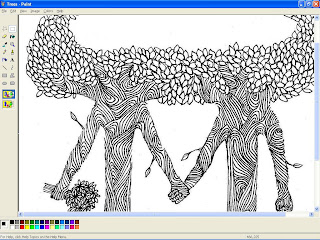
This is a screen-shot of the artwork, produced by Anna Johanson, of "Anna's Paper Bird". The original art was created on bristol white, in fine point calligraphic marker. My task here is to remove more leaves in the center of the treetops to make more room for text. Anna could have done this at the drawing board by re-drawing the image, but that is unnecessary. I can do this type of editing with Paint in 'zoom' mode. Most of the editing done on copy-work such as this is done at the bitmap, or raster level. When editing is completed, the file is saved to either a .gif or .jpg file. The original .bmp file is also saved as the work file for future use. Of course, this is an example of editing at the bitmap level, before vectorizing. I could do some of this after vectorizing on the vector IDE, but for me it's just easier to do it at this point. When I am satisfied, I then inport this file to a program which will trace this image and convert it to vector. Because I've done this for a while, I can pretty much tell that this particualr image will vector very nicely.
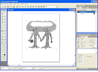
This is a screen-shot of the completed vector 'work' image as viewed from my trusty MacroMedia FreeHand 2004MX IDE . I could have also used my Mac, which has Adobe Illustrator CS-4, but I usually wind up using that for either extremely complex multi-path vector tracing using Illustrator's "Live Trace" vector engine, or if I absolutely must save a ' .ai ' file. Some platers require Illustrator .ai files, but my plater of choice, Owosso Graphics, still accepts FreeHand, which I feel to be still the most intuitive and fastest vector IDE around. Adobe had rocks in their head when they decided to drop FreeHand for Illustrator, but I digress.....
In this particular case, I used yet another vector engine, one of the best I've found outside of LiveTrace: InkScape, which is a free share-ware program. Yeah, I'm giving away all my secrets. Nobody ever said I was a very good businessman. But for fairly non complex vector traces, InkScape does a very nice job, once you learn the limits. Inkscape works on a PC, which is where I have FreeHand, so it's just easier for me to pass image files back and forth on the same computer than sending it over to a Mac. In my Studio/Shop, what's started on PC - stays on PC (if I can help it), and what's started on Mac - stays on Mac. It's safer that way.
Inkscape can save a file to several different formats. My preference is .pdf, which shakes hands with FreeHand better than .eps (encapsulated postscript). Vector images saved in 'cairo' .pdf opens up directly in most cases.
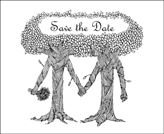
Once I have the "document" sized to the finished paper size (in Illustrator, this would be the 'artboard'), I place my image where I want it. Sometimes I have to re-size the image to fit the intended purpose. In this case, I re-size the original image to about 70%, and center to the sheet. Then I choose the font I wish to use for the text. The choice of fonts can take some time for me. I must see it work with the image. In this case, we settled on French Script. If you look at the top of the screen, you can see one of the other choices, Lombardy, which was a bit too medieval for the whimsical nature of the illustration. Anna liked the flow of the French Script. And remember: the designer knows best. Next to the client, of course!
Once the image is completed, I save either a .jpg or a .gif image, along with the native .fh11 FreeHand file, or in the case of Illustrator, the .ai file. It is the vector file that is sent to the plater. I also send one of the raster images as well, just in case the vector files does not open completely at the destination to where I sent it. The .jpg or .gif file will let the recipient know exactly what the finished image should look like. I also send the raster images to the client or designer for approval / corrections. I always send images at 100% copy size. This helps for cases where registration may be necessary. Before any vector containing text is sent, all text must be converted to image (in Illustrator, the terminology is different. I think its convert to outline or contour, or something like that.) - which converts text into....well....an image! This means that instead of the recipient needing to have the exact same font available on their computer to correctly view the image and text, the text appears as a non-text image, not requiring the use of any font at all! When you convert to line or convert to image, the program preserves the individual letters and characters as a vector outline, perfectly reproducing the original letters. This ensures the finished product is viewed exactly the way you want it viewed.
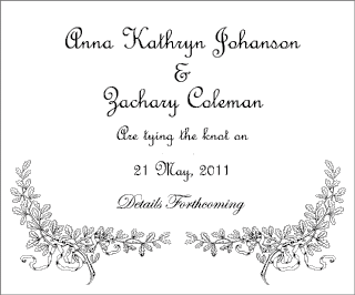
This is the inner fold portion of the Save the Date card, which also uses French Script, with a little Edwardian at the bottom. Those florals on the bottom corners come courtesy of the old Deberny Engraving company (Deberny et Cie) of Paris, France. This fine old company produced printers' cuts for commercial use during the 19th and early 20th century. These particular cuts were originally wood engravings from approximately 1880.
Well, this is how it's done, folks. After about a week, I receive the cuts from my plater (Owosso Graphics) unless I express them. Owosso Graphics can produce magnesium or copper cuts in around 24 hours if you have to do something very quickly, but by my studio and shop policy, I don't rush Letterpress jobs. Letterpress printing is a hand wrought, labor intensive process that does not work well with speed. BTW, apart from being very happy with their product, I have no connection with that company, neither do I receive any pecuniary remuneration or consideration. Just calling good work where I see it.
. . . and as you may guess, the next step is the cutting of the stock and the printing of the order.
Hope this installment helps to shed some light on the aspect of the design process. I did not shoot every single portion of the process, just the main phases. Sometimes the prep work and digital imagery required after the artwork is completed takes as long to accomplish as the artwork itself!
Good Providence in all your Letterpress Endeavors! And a Happy New Year to You All!
-gary


No comments:
Post a Comment