Sunday, September 23, 2012

A Banquet Invitation


We've been asked once again to supply the Banquet announcements, invitations and RSVPs for the Annual Central Florida Pregnancy Center's November banquet.  This banquet is the major fund raiser for this organisation for the year.  This year proves to be somewhat higher in profile, with Tim Tebow's mom being the guest speaker.  As such, there is a University of Florida connection here, which gave us an idea of the colour scheme that we should consider.  Orange and Blue.


Well, not horribly orange.  We did not wish to be that obvious.  Rather, more of a Pumpkin colour might be suitable . . . after all, it is autumn.  Creating this shade was no mean matter.  It took me close to an hour and a half of trial and error.  Finally, after mixing colours that have nothing to do with orange, and in preposterous proportions, we arrived at the perfect match for a South Alabama pumpkin!


The pattern was borrowed from a lace doily.  The paper chosen was an open fibre variety with enough resiliency to accept a deeper deboss, permitting the un-printed area to 'pop'.  I did this with a business card for a concert pianist some time back, featuring piano keys that raised themselves above the printed level.  I still run my fingers over my sample card.  A little obsessive, yes.  But fun, nonetheless.


Closer observation may reveal that the pattern design is actually triangular, placed side by side in a 'tete-beche' manner, which is anti-parallel.  Even closer scrutiny will bring you to my last installment.  Yes, our friend is none other than the corner design for the blind deboss, re-applied.  Thus, we not only recycle our paper, but our designs, too.


One fine day, I will encounter a camera that will have perspective compensation so these sorts of close-up shots won't have that center truncation effect, but as it is, using my wife's Cannon Power Shot, here is the RSVP.  We could not resist the use of the all time favourite advertising fount of the early 20th Century, good old "Cooper" for the titling.  The rest is Times Roman.


Quite naturally, I have to include several close ups.  Notice that the design actually does not bleed.  It ends just short of the 4-bar sized card.  One reason is that if it was run to bleed, there would necessitate extra cutting, which would imply going under the clamp of the large guillotine cutter.  That would require the ink to stand another 24 hours, and could reduce the "pop" of the deboss.  Perhaps one day I will have a series of cutting dies made.  Yes.  When the Kluge arrives.  What?  Yes, friends, we are expecting the Holy Graille of Letterpresses for our very own, a 10x15 Kluge.  More on that, later.


And now for a few more macro-images, slanted against the light to emphasize the deboss.  You know, this is common to all letterpress photos, really.  Dramatizing the effect in this manner is actually necessary in photo images, otherwise you'd never see the deboss.  I must add, for the sake of my fellow printers: I do not punch hard enough to bruise the obverse of the card's surface.  In fact, if I did, you would see creases in the margins of this close-up.  Open fiber papers need not be driven hard to produce a nice debossing effect.  This helps the longevity of our equipment, which is no longer being manufactured.


They really did come out nice.  This was one fun job to run, I will admit.  The way the lace pops off the edging is really engaging.  I never get tired of looking at it.  In fact, I'm running out of samples, folks I've shown it to wind up, well . . . keeping the samples.  Hmmm . . . .


Here we go, one parting shot from the production table.  We ran five hundred invitations and RSVP cards, which meant over two thousand impressions.  It was a sun-up to sun-down job, when everything was said and done.  Well worth the time.

This pattern, by the way, is available for use with any appropriate invitation and RSVP.  If you think you might find it's use advantageous to your needs, you can refer to it as the Pumpkin Lace design.  I'd call it the Pam Tebow design, but I'm afraid that name has a trademark and copyright on it.  Besides, that would be rather gauche, would it not?


That's all for now.  Stay tuned for more adventures in Letterpress!

-gary.


Monday, August 13, 2012

Combining Work with Pleasure, Installment No. 2


Welcome to installment number two, "Combining Work With Pleasure".  The work: making some of the most awesome cards that rolled off our 1936 New Series C&P Letterpress yet!  Golly, the last month saw awesome calligraphy from a world class Calligrapher, and now we are tripping back to the 1880s with genuine Eastlake tatted borders, bunted frames, and knotted lace.  Look at the blind debossed borders on the finished invitation!  Rebekah wanted some engrossed flourishes around her and Alton's name, so I went back to 1690's Londontown to borrow some penwork from Ayers, which wove nicely into the Script (Bickham Script) and flowed with the inclination and kerning of the characters.


This is the die and print.  The die is courtesy Owosso Graphics, magnesium, wood mounted.  I prefer metal dies over polymer largely owing to the crisp edge nature of metal.  Also, I am a traditionalist.  At one point I will probably start using polymer, but so far I haven't seen the huge advantage it has over traditional wood mounted metal.  As mentioned in the prior installment, the die used for the blind deboss is 16 gauge copper, also wood mounted.


The following shots are close-ups of the invitation and the obverse of the RSVP Post Card.  The ink chosen is straight-out-of-the-tube oil based brown, from "Dave's Ink In Tubes".  What we were not prepared for was the effect of this standard brown against pearl white Lettra: Gold.  Not bright and shiny, but a dense Florentine.  The combination of a debossed image in this colour, the saturation, the shadow cast by the deboss, ever so slight, and overhead lighting produced a remarkable visual!


The deboss of the border was heavy enough: we did not wish to punch the text.  The open fibre nature of Lettra permits the die to sink into the stock's surface just a bit, by its very nature, thus what you have is a nicely planted text line with a solid presence, yet not heavily punched.


A close-up of the flourishes of Mr. Ayers, Scripsit to King Charles II.


Text on the lower part of the Invitation face. 


The use of Postal Card RSVPs is gaining popularity, and the Rebekah / Alton team are no exceptions.  The idea is to save money, both on postage and on having to purchase RSVP envelopes with return addresses.  Much as I'd love to take your money, part of my mission in Letterpress is to make it as affordable for you as possible.  Post Card RSVPs are a great cost-cutting alternative.  The reverse side will be printed as well.


Close-up of the message side.


I used some of the same flourishes as appears on the Invitation.


The border is printed within one thirty-second to one sixty-fourth of an inch to the edge.  It was verrry tricky to feed. While the border carries the same basic design elements of the Invitations, they owe much more to my background in Stamp Collecting (Philately), in that many of the 19th century classic postage stamps used the eyelet lace motife for borders.  In particularly, the Letterpress printed postage stamps.  Proving once again that if you want some great classic design ideas, go to your local Stamp Collector.


Ahh, yes.  The couple, checking out Alton's handiwork, my latest "apprentice". (grin)


"Uhh....doesn't "November" have an "r" at the end of it?"


"Just kidding!!"

Whew!  Don't scare me like that!

And now, set back, grab some pop-corn, and enjoy our latest little vid: Alton Punches Paper with 1200 pounds of iron in motion!


That's it for this installment.  Stay tuned for the next installment, when Alton says "Hmm....I wonder if I can crush pennies. . . . . ?

-gary.


Tuesday, August 7, 2012

Combining Work With Pleasure


One of the unique features of having a Letterpress Shop, even a hole in the wall like mine, is that you can do things other folks can't do.  Like, for instance, how many of y'all made your own glasses? (Opticians don't count!)  

Last night we began the final process of producing Alton and Rebekah's wedding stationery.  This was wholly their design, they just told me where they wanted what stroke to be put where.  Alton and Rebekah are no slouches in areas requiring imagination, creativity, and design.

The initial design unfolded with the idea to create an inner envelope liner made from paper lace.  Having secured a sample, I based the debossed border design after the basic lace pattern.  The result produced an almost Eastlake Victorian design with enough filligree to compliment the text, which will contain flourishes sampled from the work of Ayers, who was an English Scribe of the 17th century.  I tried to do the flourishes myself, but frankly, I don't have that kind of hand these days.  That's why I stick with Blackletter.

The lace design is nestled in the corners, with repetitive elements serving as borders between the corners, again, themed from the central lace design.  The design is "blind debossed" onto a 5x7 vertical card, forming a delicate and very pleasing dimensional visual.

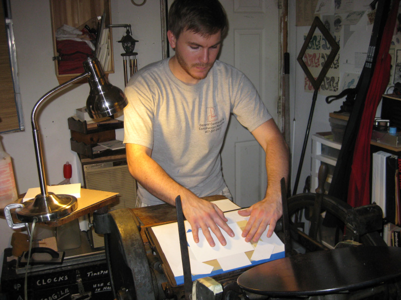
After a very tricky set up (we are using a margin of less than one sixteenth of an inch all the way around the border!), we began the process of debossing from the copper die, courtesy Owosso Graphics, with the press set on it's slowest speed.  It was somewhat tricky to 'feed' this set-up, but after a while, we were up to about one impression every three seconds.  For this sort of thing, not too shabby!  Alton, the groom-to-be, wanted to give it a try.  Very soon, he became an old hand at this.  But then, I know Alton: it was a cinch he would acclimate to my press quickly.  Below is a sequence of Alton feeding my 8x12 Gordon.


Firt off, Alton "fans" the stock.  Would you believe that 'fanning' is one of the hardest things for me to teach at a workshop?  Fanning is a way of spreading out the stock for feeding and / or counting.


He gently slides the card into the paper guides I rigged up on the tympan.  I could not use my standard gauge pins for this part of the edition because the edge of the paper is nearly flush with the edge of the die itself.


Ensuring the card is properly placed, Alton reaches for the impression lever and makes the impression.


Ahh, yes.  There is is.  Ready to repeat the cycle.

The debossing of the border with "clients" on hand became a type of workshop that I do not always have the opportunity to enjoy: having the client actually take part of the production, with their hands on the Helm, as it were.  It was fun to watch and participate.  Rebekah, not in the photos, was standing on the opposite side of the press watching.  It was just as fun watching her amazement and fascination with the process.  Alton later told me the most important part of the night was the idea that came home with each impression: "Wow, this is really happening!!"  Yes, Alton, it is really happening.  And we are so glad that your Sovereign led you two to each other!

So, what does the design look like?   I took a few shots using a lamp that was recommended by Kim Austin, of Austin Press, San Fransisco, although I have yet to have room for the light tent and set-up. These photos were shot with my sweet wife Cindy's Canon Sure-shot under a 6500k lamp:


Can you see how close to the edge we are making our impression!  There is only one-thirty-second of an inch all the way around.  Beyond set up, there was no waste.  Good going, Alton!!
. . . yeah, that's an I-Hop cup.  Don't even ask . . . .


As we proceed with this unique order, I will keep you posted.  As for the design, I will be making this available as one of my border choices available through G. Johanson, Letterpress.  We are naming it after the Bride to Be: Rebekah.  If you like this design, ask for the "Rebekah" Eastlake border.

Stay tuned!

Good Providence in ALL your endeavours.

-gary, the Printer.


Tuesday, July 31, 2012

Calligraphic Collaboration!


Angela Welch has been creating awesome calligraphy for people all over the world.  She is the closest thing to a "Zanerian" that I know, that is: she handles the pointed Spencerian pen with a competency that is outstanding.  Little wonder that she's created designs for Crane & Co., for international clientele, and has even found herself working at her Art in the presence of the Vatican Guard! (that's another story.)  When she asked me to print her Wedding Stationery designs for her client Mandy, I fairly jumped at the opportunity.

This order called for an A7 invitation with envelope liner, including a printed return address, and a 4-Bar sized RSVP with printed address on it's envelope.  Stock selected was #110 Ecru Lettra.  Four magnesium dies were involved, and about two solid weeks working with the copy.  

Angela sent scans of her work, which which were perfect.  The challenge, however, is to take that file and make an intelligible "black file" for plating.  This is where the raster file is converted to a vector file for sizing, and is the file the Plate & Die maker uses to create the letterpress die from.  

Being a calligrapher myself, I have a pretty good idea how the finished product is supposed to look like.  The   challenge is to preserve the look of a hand-executed piece.  This involves paying close attention to the thick and thin strokes.  A great looking 'thin' that will impress into open fiber stock and leave a great line may turn out to make the thicker strokes too heavy.  Backing off the thicker strokes may cause the thin lines in the flourishes to break up, or become too thin.  Sometimes I have to go into the original raster scan and physically edit the thin or thick so the vector 'engine' can plot a course that makes sense and leaves the line the way I want it.  And when the copy originates from a hand drawn line on proper paper that draws ink from the pen for a well executed piece, sometimes the macro-close up nature of a scan can make what appears to be a smooth line. . . pretty rough.  Enough to confuse the vector plotting.

Needless to say, it was a challenge, and the end product was worth the effort!  We held a very delicate thin line, and a healthy thick downstroke.  The most important thing was that the dies conveyed a great impression into open fiber stock that left a nice deboss, yet retained the hand-wrought calligraphic look.


The printing was accomplished on my 1936 New Series C&P, moderate hard packing, and I got to use my brand new Megill adjustable gauge pins!  Man, talk about easy set up.  The only thing that really took time were the 4-Bar envelopes.  I had to place a card-stock insert into each envelope to avoid the effects of the glued envelope seams on the back of the envelope.  These seams can interfere with the impression and create unwanted darks, lights, and complete misses because to a Platen Job Press, envelopes never lie flat.  There are variously thicker in some spots, thinner in others depending where the rear seams are placed.  Here is a shot of the mid-run.


Aren't those gauge pins pretty?  They screw down very tightly, thus eliminating the need to tape or drip wax or hot glue or any other added method of locking the gauge pins into place once set.


This shot was taken from the take-up pile. One thing about feeding envelopes: definitely a hand-fed job.  


Here's the finished grouping, with the RSVP envelopes on the left, Invites in three piles, and RSVPs in two and a quarter piles.


Here's the rear flap of the AS envelope.  The colour of the envelope is Ecru, but it was shot using a 6500k flourescent bulb, which tends to make Ecru look more like Pearl White!


This is the pre-addressed 4-Bar envelop for the return cards.


A bit of a close-up of the envelope.


The RSVP card.


A macro shot of the RSVP


I love the Flourishes on these cards.  Angela is great at determining when enough is . . . enough!


Here is the five by seven inch  invitation 


And here is the whole set, minus the 'inner' A7 envelope.

Well, that's what's new here at G. Johanson, Letterpress.  Stay tuned for more entries coming up.  


Good Providence in ALL your Letterpress projects.

-gary.


Sunday, June 17, 2012

Philatelic Art: Enduring Design


Two hobbies of mine have shaped my life and course of future: Amateur Radio and Stamp Collecting.  It's hard to tell which had the greater affect, as far as avocations go.  As a Letterpress Printer and designer of my products, I draw heavily from the classic works of bygone styles.  Having collected postage stamps since I was six years old ( I'm 57 now ), I find that now, more than ever, I go to my philatelic books, the catalogues and the albums as a design resource for my work.  It seems that as graphic artists these days, particularly those that are fellow patrons of the Black Art, become more and more 'whimsical' in their designs - I guess that's the word for it - I find myself seeking refuge in the sharp clean lines, the inherent symmetry, the fineness of detail, the excellence of execution of postal ephemera of the mid to late nineteenth century.  These classical designs are not "all over the place" or sketchy.  They are solid.  Definite. They have presence, and communicate their importance.  They are works of art.

What amazes me is that amidst the detailing and microscopic fineness (for the most part) lay a vast reservoir of techniques that can speak to us in this "New Millenia" we've entered. Balance, Beauty, Utility, all combine in these micro-miniature posters which were printed around the globe, describing their countries of issue.  Maps, Rulers, Coats of Arms, History, Literature, Cartography, Economics, each stamp teaching those that cared to look a little of their country of origin.

One such design that I have of late worked with in my studio is the 1849 "Ceres" stamp of France.  This was the very first postage stamp ever printed by France, only nine years after Great Britain issued the world's first adhesive postage stamp (the Penny Black and Two Penny Blue, 1840) and a scant two years after the United States issued it's first adhesive postage stamps in 1847.  The designs of Britain and the United States were absolutely gorgeous, and being line engraved, both were intensely detailed.

Not so the French fledgling offering.  It was surface printed (Letterpress, the old catalogs call them as being "typographed").  It was much, much simpler.  It featured no ruler's portrait, no hyper intense turning.  It featured simply a Grecian side border design and an ancient profile of Ceres inset into a simple disc resembling some ancient coin.  And yet in all it's simplicity, the design elements, merely a collection of lines and dots, play together in an amazing unity, presenting a very attractive piece of art.  In fact, so simple was it that I endeavored to reproduce it's elements for my own shop.  To make it very obvious it is not a forgery, I altered the legend (France never issued a Universal Postal Card in this design), the line shading behind the disc, and added my own initials "INV GGJ" at the bottom.  This 'borrowed' design will grace some stationery I hope to offer, based on classical nineteenth century postal ephemera.


Above is the actual stamp.  Very clear, a clean impression, a gorgeous classic.  Simplicity in a nutshell.  As I began to research the design, discovering the elements it contains, I was struck that apparently, several countries felt the same way I did!  It was amazing how this design was repeated over again in different countries spanning almost two decades after it's initial 1849 French release, to whit:


Greece . . . . 


Spain . . . . 


Finally, Ecuador.  

This was just from briefly cruising around the Internet, cherry picking images.  There are probably many more.  The use of this design seems to span from 1849, up to 1865.  Sixteen years, possibly more.  That's what I call an enduring design, considering these were the earliest of issues from these countries.  No doubt that officials from these countries admired the stamps they were receiving from their correspondence with the French Republic.

Well, it's not lost on me that as a design rooted in ancient Greece, Greece might be interested in using it.  Other Latin countries might share tastes similar to France, after all: Spain and France had been politically connected off and on for a good part of the 16th and 17th centuries.  What's there to be surprised about?  But cultural similarities or not (I wonder if Italy......) a good design is a good design, by any stripe!  A twenty year run stemming from a single design, not bad.  Not bad at all.

Long Live Philatelic Design!!

-gary.


Tuesday, May 15, 2012

New Megill Gauge Pins


I ordered some new gauge pins from American Printing Equipment & Supply Co., to supplement my waning supply.  Owing to a rare miscalculation on my part, I very nearly lost one of my favourite Megill Double Grip gauges.  The close call reminded me that I should get more - while they are still available.  So I did.  NA Graphics stopped carrying them, apparently, but I found them at the above mentioned location.  

Now, normally, these pins came in what I consider the normal dark carbide metal with brass tongue, screws and slide.  What I got totally surprised me.  The slide and body came.....chromed!  Chromium plated gauges.  Boy, talk about adding class to the ol' Shoppe!  


I thought that perhaps these may have been recycles chromed over to hide their years of use.  Close scrutiny reveals that if this is what they are, they were in awfully nice shape to begin with.  No, I think they are new.  Either way, they are nice.


Everybody has their flavours in life, Letterpress printing is no exception.  I use Kort Quad guides down at Mama's Sauce when I do work for them down in Orlando (I'm one of their Klugemen) - I have to say, these Double Grip gauges have been singularly the best, probably the most enduring and easiest gauges I have ever used for long haul work.  With the old stand-by Flex-pins, you have to make two penetrations in the tympan and slide the center pins through.  With the Quad Guides, you have to make two relatively long slices for the fore-and-aft blade grips which requires a considerable amount of pressure to open the "jaw".  I've ripped my share of tympan.  The Megill Double Grip gauges require only one single inch-long slice perpendicular to the feed line, and that's it.  You can set the holding pressure lightly, to set the pins, then tighten with the nut tightening tool that comes with the set (see top photo).  They adjust very easy, they lock like a vise grip, and if you take care of them, they last for ever.

And, in a pinch, they can make a dandy tie pin!!  I'll wear one to the next wayz-goose.

-gary