Tuesday, May 31, 2011

Kluge Proofs


These are a few images of some proofs we made from the 12x18 Kluge at Mama's Sauce over the weekend.  The Debossing was done at the 'Sauce down in Orlando, the inked text was run from the NS 8x12 C&P at my place (G. Johanson, Printer).


The stock used is 220# / 600gsm Crane Lettra, their thickest cover stock.  This was selected owing to the deboss, which covered very nearly 7 inches.  The stock behaved quite nicely, especially where the depression comes close to the edge of the stock.  No creasing or warping.


Debossing tends to polish the paper where the die face meets the fibers, creating an interesting reflection and shadow-play.  I angled the cards to create the shadow, showing the depth of the deboss.


Here's a shot of the text.  After we did the leveling of the Kluge's platen, and the testing of the deboss., I thought I would simply take these test cards home, 40 minutes north in Volusia County, and ink up my own press and do some proofs of the text block.  Just to get an idea of the finished product. 


The inked text debossed nicely too.  Here, we do not want to punch as deep as with the blind deboss image.  Type will slice fiber, which makes it possible to punch through the stock if you aren't careful.  You want a nice balance of sharp ink transfer and enough depression to create a pleasing presentation.


Here's a bit of a close-up.  The ink is a Charcoal gray, 3:1 dense black to opaque white.

So, this is what we did over the Memorial Day Weekend.  Hope your weekend was good, too!

-gary


Tuesday, May 24, 2011

Anna & Zac Coleman's Wedding: Photobooth


Well, the nearly one year's worth of planning and getting stuff together, printing Invites, RSVPs, Coasters and Programmes, going back and forth to the venue 45 minuites away finally came to fruition at six o'clock p.m. on Saturday, May 21st, 2011, in spite of Judgement Day!   The funny thing was that we, the parents, were also married on another famous predicted day of the Second Coming: September 24th, 1988!  Could it be that the Johanson Family is messing up the Divine Timeclock?  ( I hardly think so.)

The wedding was held at Harmony Gardens, DeLeon Springs, Florida.  One of the fun things we set up was a Photobooth consisting of a three sided tent, a picture frame hanging from wire, a tripod, my sweet wife's digital camera, lots of cheap costume props, and a lot of folks with character playing around with it, including the Bride herself.  This is a sequence of over 100 photos taken that evening. 

So Anna and Zac, from us (crazies) to you: all the Sovereign's best in the years to come!

And Anna: get some ideas while you are skipping and hopping up there all over the Smokies ,for some Paper Bird designs :>)

-g.

Sunday, May 1, 2011

Invitations for Jessica & Felix!

Jessica asked me to do some Invites for her down in the Coral Gables area, my old stomping grounds (back when we had White Tower Hamburgers and Burger King wasn't even thought of yet!).  The plan was to have a heavy blind cursive deboss covering close to half  of each card.  Because of the broad area of coverage, we opted for the heavier cotton rag stock, Lettra 220#.  While debossing is common in Letterpress, particularly the blind deboss, wide area coverage on average thickness cover stock such as 110 could create a very heavy depression on the rear, and worse, since the deboss comes so close to the edge, could create a crease.

Both RSVP and Invite will be housed in Crane's matching envelopes.  All dies are designed via FreeHand, and are etched in 16 gauge magnesium, hardwood mounted by Owosso Graphics, who does a killer job.  Why not photopolymer?  I'm a traditionalist, and prefer metal if I can possibly use it.  For debossing, I believe it's the best thing to use.  Yes, it costs a bit more, but honestly, not significantly so. 

Oh, there's ink used, too!  It will be a softened black, a shade of charcoal to de-emphasize severe contrast between the Pearl White and the darker text.


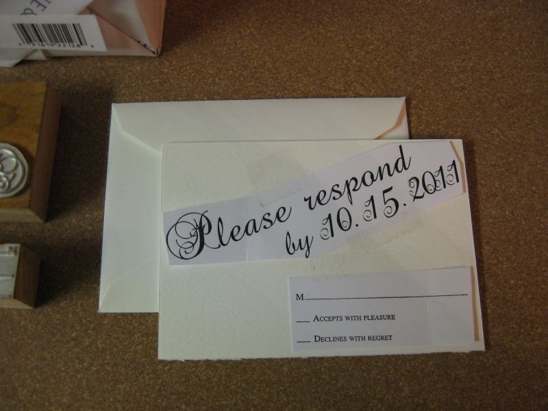
So, here we are, dies, envelopes, paper and "paste-ups", which are made from Owosso's Proofs.  They are cut and taped into position on cut stock to give an idea of proportion.


A close-up of the deboss and text dies for the A7 size invitation.  Each card will go through a press twice, once for the deboss, for which we will use the big locomotive sized 12x18 Brandtjen Kluge, and then once through an 8x12 C&P platen jobber up at my shop.  I could do the whole thing there, deboss and all, but that's a lot of ink, and technically, I am borrowing time into Nick's work-flow, so while I want to take my time to do it right, I don't want to gobble up all the production time at that facility.  Thus, the heavy work is done at Mama's Sauce, Orlando FL, the inking being done at G. Johanson, Printer, in Deltona/Orange City, FL.  Incidently, if you go to the Sauce link, one of the videos shows the Kluge in action, starring Nick and Yours Truly. 


These are the mag dies for the RSVP.  Again, the top die is for the blind deboss, the bottom die is for text. 


The next shots are of the mock-up, or "Paste-ups", which use the actual proofs supplied by Owosso. Graphics.  These guys do a great job.  And frankly, anyone who takes FH11 files is awesome in my book.  The above image is the RSVP


This is the A7 invitation paste-up, on the actual 220# cover stock, Lettra 220# Pearl White.


Just to give you an idea of the thickness of 220#, here's a close-up of one of the corners  While not beer-coaster thickness (which is another thing I do: Beer / Drink coasters.) - it's pretty beefy stuff!  And oh, is it posh.  I've heard this product referred to as Letterpress Crack.


This is a shot of both Invitation and RSVP in the same envelope, along with the RSVP 4Bar envelope.  I love the simple elegance and understated presentation of unadorned Pearl white.


And finally, this is the 'bundle' all put together and placed in Crane's A7 Pearl White envelope.
Well, that's pretty much it for this installment.  Stay tuned for the next progress report.  There may be a film short of the debossing at Mama's Sauce using the Kluge.  It's an impressive machine, which must be hand fed owing to the stock thickness.

Good Providence in all  your Letterpress Endeavors.!


Friday, April 1, 2011

Finishing Touches for the Reception

Boy, "The Time" is coming quickly upon us.  Last month, we ran the invites and the RSVPs with addressed envelopes.  Now, ideas are popping up for what to do for the reception.  A popular item that seems to be getting a lot of press from Victoria and Good Housekeeping, plus State and Regional Wedding Industry publications is the Pulp Drink Coaster.  So I contacted my fav vendor and the artist / bride-to-be.  Two millimeter four inch round coaster blanks were still the same price as they were when I ran my last run of coasters, and Anna determined that her original artwork used for the invitation design could be adapted to her liking, so we did a little digital magic and voila!


These will be reception gifts, banded in groupings of six, which will be placed on the tables at the out-door reception venue at Harmony Gardens, DeLeon Springs, Florida.  Since the wedding colours are teal and coral, I used my original CYMK (read: eyeball) mix formula and made up some custom teal for the coasters to match.  Instead of belly-bands, we are going to tie formal ribbon around each set of six, to give a more lacy and whimsical effect.


Hear is a shot of the coasters, hot off the press.  I ran these on my 1936 Chandler & Price "New Series" platen "job press", which is the perfect press type for coasters such as these.  We discovered that you really don't want to 'punch' pulp-board, that is, you cannot really strike a deep depression, or 'deboss' in pulp board owing to it's naturally short grain, which cracks rather than gives.  However, you can give a nice impression


This photo shows the level of impression that can be had just before the pulp gives way to cracking, which is fairly considerable.  The original artwork was pen and ink on paper, which is perfect for Letterpress because of it's natural high-contrast dynamic.  Pen and Ink illustration and Calligraphy are perfect sources for Letterpress Typography, which is why I always encourage folks who wish to design and illustrate for letterpress to utilise these traditional tools.  The steel nib pen or the quill, india ink, bristol board with a slight polish, Rapidograph pen or the more modern counterparts. 


Here is a close-up of how close I could take the image to the edge without sending a crack.  Pulp is amazingly resilient, so long as you don't broach the cracking point.  I wanted to avoid any bleed because if the image did this, then I would have to use parent sheets, cut the board down to press size, run it, then die cut it.  That is not only hugely time consuming, but it's also not a money saver.  Two millimeter board is not available in parent sheet anyway, so just as well design for availability, and save the client some money.


Here they are, One Thousand Coasters.  Hmm, that sounds like a group of indie buskers down on a St. Augustine street corner!  (Gary is thinking of "One Thousand Portraits", who, with "Waterdown", created some landmark music in the Christian Contemporary Music scene, some of which was picked up by Third Day.)

Well, as Walter Cronkite used to say: "That's the Way it is . . . . "  for 1 April, 2011.  Another press run at G. Johanson, Printer.  Only one more thing I might add: many of you may have checked out my video showing the makeready for the last coaster run from last year.  I did the same thing.  Would you believe that I had no makeready waste?  Everything registered perfectly, centered exactly right, with the very first impression!  Usually, it takes between ten and, depending on the colours used or how many times you have to feed your project through the press, twenty-five percent of your stock to properly set up, ink up and get your impression and registration lined up properly for your run.  And when your stock costs a couple bucks per sheet, that's a lot of waste!  But you MUST use the stock you are going to run, so it's unavoidable.  Using the transparency method really helps me out a lot, and I can transmit that savings to the client! 

Good Providence, fellow Letterpress Artisans, in all your Printing Endeavors!  And to you Brides and Grooms to be, looking forward to that Big Day, I wish you "God Speed".  The best house is always built upon a firm foundation, and the firmest foundation anyone can have is Jesus Himself, Who is abundantly able to carry you safely home.  

God Speed.

Tuesday, February 22, 2011

Another Hornbook Edition in Process!


Ok, it's that time again!  Sufficient orders have been placed to proceed on a new production of the Colonial American Hornbook, part of a series that I initiated back in 1992 at Heirloom Press, Palm Harbor, Florida.  As with each production, or should I say, 'Edition', because these are books, the very first Public School Books on our shores - this one is unique.  Prior editions used various types of Pine, which would have been one of the woods available to the Printer of Massachusetts Bay and Providence Plantation of 1700.  But hardwoods were certainly available, too.  This Edition is Hardwood, stock Poplar.  Nails are cut copper.  Also, we are going one step closer to the original decoupage process: Shellac.  This makes things a bit slower.  Shellac goes on in much thinner layers, and build-up will probably result in more layering, with steel wooling between each layer.  The 'up' side is an interesting and attractive patina.  The downside: more time with steel wool, circle-scrubbing each layer, front and back.

What is remaining the same is the printed face piece, and the cherry stain.  Poplar does not drink in the stain like pine, it rests more on the surface.  This offers the opportunity to 'age' a book by sanding the extreme edges of the wood to bring the lighter wood behind to somewhat show through the stain, creating a time-worn look.  This is a new thing for me, but I like the variety this creates!


The production run on this edition is a bit smaller because the wood available comes in shorter lengths and is more expensive.  In the above photo, three books are drying while the upright one is mounted on it's jig awaiting the next coating of shellac to be brushed on.

That's it for now.  If you wish to know more about the Colonial American Hornbook, America's very first public school "Textbook", you will find a link to my Hornbook FAQs in the links section to the right, and more photos.

Just a reminder: these books are $15.00 each, plus $5.00 postage. If you would like one, drop me a line at wd4nka@aim.com  .  I also usually give notice of upcoming releases on the Letpress List, the Florida Letterpress Yahoo Group, and, of course, here on the blog.  Please allow 2-3 weeks to receive your Hornbook, in that this is about how long it takes to make them and permit the decoupage layers to cure.

Good Providence in all your endeavors!

gary

Wednesday, February 16, 2011

Anna's Announcements

Anna's Wedding Announcements were designed by herself.  The original artwork was in Micron pen, scanned and vectorised.  Colours are Teal and Coral. Paper is 140#/300gsm Canson Watercolor.  The colour is identical to Crane's Pearl White.  All text is 'French Script'.  Two Hundred of these two-colour fold-over A7 announcements and 4-Bar RSVPs ran today, plus the scoring of the A7 card.  No mean feat, it was entirely hand fed on my 8x12 New Series C&P Platen Jobber.  Including the time to wash up between colours, blending the colours (Inks: Daves Inks In Tubes.  Thanks for getting these inks out to me so fast, Dave!!),  and all the makeready typical for a job that passes through the press once for each colour, plus once more for scoring, I was on my feet from eleven in the morning until ten o'clock tonight.


Here is the full set, A7 Fold-over announcement and RSVP card.


A closer look at the RSVP card.


A little detail.  We thought the French Script went well with the airy, whimsical feel of the design.  It is very 'Anna'.


What I love about this card is the cover.  That's Anna and Zac, her fiance.  I think they were sitting on a porch swing.


The interior is my design, actually.  I took part of the flora that Anna drew, and using FreeHand, duplicated it in vector, to create the border, and keep continuity.


A close-up of the border detail. Owosso Graphics, once again, did a superb job with the metal dies used to make this suite.


A close-up of the inside text.  While I allowed for substantial deboss of the illustrations, I opted not to go so deep with the text.  There is still a little deboss, but the letters are very crisp and sharp.  Debossing can interfere with sharpness of image, ink distribution on the die must be carefully monitored.


A closeup of one of the dandelions on the front cover.


....and - a closer look at the front cover design.  Anna's wedding colours will be teal and coral, so we repeated that colour scheme with the Wedding Stationery as well.


Well, that's about it for this installment.  Cards came out great!  Special thanks to Nick and Mama's Sauce for the use of his paper-cutter to cut down the parent sheets.  Your a lifesaver, bro!


Good Providence in all your Letterpress endeavors!


Monday, January 17, 2011

A Special Greeting.


This card is another of Anna's Designs (Anna's Paper Bird), printed on Pearl Lettra in a muted gold oil base, which stands out very nicely, yet is understated.  The card format is A6, approx. 4.75 x 5.75", and includes a matching Pearl White envelope.  Inside is blank.  Anna has designed a few of these whimsical "Robot Cards", but I think this one is my favorite.  The artwork was designed the "Old School" way, pen and ink on a drawing board, scanned at 600 dpi, then vectorized by Inkscape.  Plating was executed by Owosso Graphics.  Hand fed and scored, one by one, on our 1936 Chandler and Price "New Series" 8x12 Letterpress.

These cards are limited edition pieces of original art.


The formal name of my Studio is "Q-5", which is part of G. Johanson, Printer.  The attribution on the reverse of this card is handset in 10pt Sans Serif metal type, the actual font name is yet to be determined.  It was cast by a foundry under contract by Kelsey sometime in the 1940s.  Kelsey was well known for using ATF faces and re-naming them.  For instance, "Marquee" was renamed "Marquery".  But I like the look, so we used it.  I'll let Kelsey and the American Type Founders duke it out over the name. (Both are long gone, anyway.)

We are selling these pieces in sets of five, plus envelopes, for ten dollars ($10.00 USD) per set, plus shipping.

The reason why we are selling these cards, aside from the fact that they are one-of-a-kind examples of both Anna's work and Letterpress Printing - is because they are also serving a very special purpose:

There is a small group of young men in our College & Careers department who are trying to raise money for their mission to Guatemala.  They will be working with a well known ministry to the skate board community in that country.  And in this economy, folks are watching every nickel. Raising funds isn't easy.

This is why Anna and myself have teamed up to help support this endeavor.  All proceeds are directed to the effort to get Jimmy, Mikey, Collin and John down to Guatemala by March.  This is just our own contribution to this missions effort.

The College & Careers group is a ministry of  Deltona Alliance Church, Deltona, FL.

Place orders, or contact me at:  wd4nka@aim.com

Good Providence in all your Endeavors!

-g.


And now for your viewing pleasure and interest, here is Josh doing the honours on our baby C&P!