
Jessica asked me to do some Invites for her down in the Coral Gables area, my old stomping grounds (back when we had White Tower Hamburgers and Burger King wasn't even thought of yet!). The plan was to have a heavy blind cursive deboss covering close to half of each card. Because of the broad area of coverage, we opted for the heavier cotton rag stock, Lettra 220#. While debossing is common in Letterpress, particularly the blind deboss, wide area coverage on average thickness cover stock such as 110 could create a very heavy depression on the rear, and worse, since the deboss comes so close to the edge, could create a crease.
Both RSVP and Invite will be housed in Crane's matching envelopes. All dies are designed via FreeHand, and are etched in 16 gauge magnesium, hardwood mounted by Owosso Graphics, who does a killer job. Why not photopolymer? I'm a traditionalist, and prefer metal if I can possibly use it. For debossing, I believe it's the best thing to use. Yes, it costs a bit more, but honestly, not significantly so.
Oh, there's ink used, too! It will be a softened black, a shade of charcoal to de-emphasize severe contrast between the Pearl White and the darker text.

So, here we are, dies, envelopes, paper and "paste-ups", which are made from Owosso's Proofs. They are cut and taped into position on cut stock to give an idea of proportion.

A close-up of the deboss and text dies for the A7 size invitation. Each card will go through a press twice, once for the deboss, for which we will use the big locomotive sized 12x18 Brandtjen Kluge, and then once through an 8x12 C&P platen jobber up at my shop. I could do the whole thing there, deboss and all, but that's a lot of ink, and technically, I am borrowing time into Nick's work-flow, so while I want to take my time to do it right, I don't want to gobble up all the production time at that facility. Thus, the heavy work is done at Mama's Sauce, Orlando FL, the inking being done at G. Johanson, Printer, in Deltona/Orange City, FL. Incidently, if you go to the Sauce link, one of the videos shows the Kluge in action, starring Nick and Yours Truly.

These are the mag dies for the RSVP. Again, the top die is for the blind deboss, the bottom die is for text.
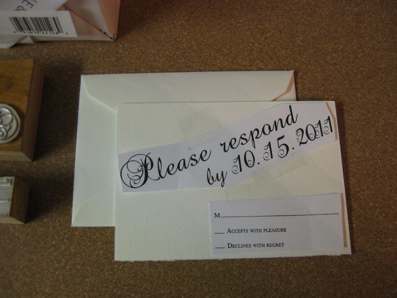
The next shots are of the mock-up, or "Paste-ups", which use the actual proofs supplied by Owosso. Graphics. These guys do a great job. And frankly, anyone who takes FH11 files is awesome in my book. The above image is the RSVP

This is the A7 invitation paste-up, on the actual 220# cover stock, Lettra 220# Pearl White.

Just to give you an idea of the thickness of 220#, here's a close-up of one of the corners While not beer-coaster thickness (which is another thing I do: Beer / Drink coasters.) - it's pretty beefy stuff! And oh, is it posh. I've heard this product referred to as Letterpress Crack.

This is a shot of both Invitation and RSVP in the same envelope, along with the RSVP 4Bar envelope. I love the simple elegance and understated presentation of unadorned Pearl white.

And finally, this is the 'bundle' all put together and placed in Crane's A7 Pearl White envelope.
Well, that's pretty much it for this installment. Stay tuned for the next progress report. There may be a film short of the debossing at Mama's Sauce using the Kluge. It's an impressive machine, which must be hand fed owing to the stock thickness.
Good Providence in all your Letterpress Endeavors.!
No comments:
Post a Comment