Monday, October 29, 2012

Isabel's Open House!


Some of you may recall the installment on this blog, where I hosted a one-on-one workshop with Isabel, chief cook and bottle washer for 9th Letter Press, who recently held an open house on their premises in Winter Park, Florida.  Isabel is a talented artist / artisan, designing her own stationery, printing commissioned items as well, such as wedding announcements and other ephemera.  Her location is just three blocks shy of Fairbanks, on Orange Avenue.  In fact, not far from the birthplace of both Rifle Paper Co. and Mama's Sauce.  Right where I lived as a high-schooler, and on the same road where I found my first job in the Printing Biz, Robinson Press, forty years ago.


There were many in attendance, and among the fellowship of local print artisans were educators, calligraphers, Anna & Nate from Rifle, Sarah from Bella Figura, her mom, who is a fellow calligrapher.  In fact, I spent almost half my time talking to Sarah's parents.  Also there were Isabel and Sheli's family.


Cecilia, Isabel's mother, is responsible for the awesome hors d'oevres, show in these photos.  I spent a considerable time in conversation with Isabel's parents (as her former instructor, I had to give them their kid's report card, y'know!)


Cecilia, if you're reading this: next time you come a'baking, and I find out about it, I'm there!!  You can cater my open house any day of the week!  See these pumpkin cupcakes?  Tooo dye for!


This 110 year old Iron Horse is "St. Peter", guardian of the Shop.  He is an 1890s vintage Chandler & Price "Old Series" 10x15 platen "job" press, which does literally all of Isabel's impressions.  We worked on her from out of Isabel's garage for a time, bringing her into serviceable condition.  That was a story in and of itself!  St Peter is powered by a 1/2 horse Marathon Farm Motor (just like my New Series 10x15, soon to become property of yet another Letterpress Studio in Land o' Lakes, Melissa, of Creative Brainbuzz/)  


I must say, there had to be at least 250 people both inside the studio, and overflowing out into the parking area where tables were set up.  My goal last night was to master the art of 'strategic standing', so as not to get in anybody's way.


Ah, yes.  Let's see: White and Red Zinfandel (?), South Hampton Pumpkin Ale - that was surprisingly good, plus another brew on pump, seemed to be an IPA of some type.  The center dispenser has Harry Potter's Pumpking Juice.  Beverage to Spike the Nite for our Delight!  - with due paraphrase apologies to J.R.R. Tolkien


Several trips to and fro the snacks, the beverages, the conversation, meeting faces again, and for the first time, hugging necks, meeting spouses, it was a great event.  I was glad our local resident hurricane Sandy decided to blow out, and drop down excellent weather for the evening.


I think I was the only one that came in blue jeans and flannel shirt.  I'm a little too laid back to get into the suit and tie gig, although my sweet wife informs, that I had better start imbibing said 'gig'.  I might be putting one of these things on myself soon.  Yeah.  I'll have Avett Brothers do the music, too!


Do some of the imagery seem blurred and out of focus?  Yes, there was quite a bit of activity, even out in the parking lot.  Folks just seemed to keep coming in!  Pretty good, considering about half of the mailed invites got lost in the mail, never delivered!!  We think it may have been due to the gold metallic finish on the mailing envelopes that could have confused the mail scanners.  Something to think about when choosing an envelope finish, btw! 


Our parting shot for the evening will be of this amazing little mobile caterer, the name of whom I absolutely forgot!  When I find out, I'll post their names.  They make Crepes!  Any kind, you name it, and right from the truck.  Super friendly folks, average cost was about six bucks.  For a nice filled crepe, you can't touch that at a Creperie, believe me!

We here at G. Johanson, Letterpress - meaning me, my wife, and designer daughter Anna Coleman (who works at Rifle Paper Co. btw!) wishes every good blessing and all that Providence will provide, for Isabel,   Sheli and Staff at 9th Letter Press.  I am proud to count you among my friends, fellow artisans, and co-conspirators in the Black Arts!

May ascribing a proper description of our Creator in everything we design and print be our goal and purpose, a tradition and purpose handed down from Herr Gutenberg himself.  Sola Deo Gloria!

-gary.

Tuesday, October 23, 2012

Getting Melissa's Press Ready!


Melissa will be picking up her 1916 Chandler & Price 10x15 New Series Platen Job Press soon.  What needed to be done to it was mainly making it operable.  It needed a new motor and belt, a switch, switch wiring, motor wiring, new front and swivel boards, and a de-gunked ink fountain.  She also needed two new 2x8 boards to rest upon.  I wanted to give Melissa a preview of the press, now that it's ready to roll.  Here goes!


The first group of photos shows the ink fountain which had to be disassembled, cleaned, the ink blade scraped and "sanded".  Then, with cleared oil ports, it was put back together and bolted upon the press.  All petcocks turn easy.


1.


2.


3.


4.


5.


6.


7.


8.


9.


10.


11.


12.


Amazing how a photo changes with the addition of a flash!

The next grouping is the press set-up.


I installed a 'safety switch' to provide easy and quick operation.


The switch is bolted on the left hand under-side of the front feed board.


The motor is a 1/2 hp Marathon 1725 rpm Farm Motor, sporting a 1" pulley for the 'v' belt.  This provides a cycling speed of one impression every 2.5 - 3 seconds.  It can be slowed by belting direct to the shaft.  Notice that the motor is wired to a female outlet.  The switch actually controls the outlet, rather than the motor.  You can see the steel shielded "extension cord" plugged into the outlet.  The power is switched here, rather than the motor.  I wired it this way for ease of installation.  The motor and outlet stay together, with the switch wiring hardwired into the top of the outlet box.  The box is then literally plugged into a standard wall outlet.


These are the new boards, both cut from  furniture grade birch ply.  Aluminium channeling edge the front and rear of each board.  These are cut to the original boards' dimensions.  The original boards - also ply - had delaminated over the past 96 years. 


The ink fountain is re-mounted.  This is the original "full" fountain that came with this press.  Also included is the original motor bracket holding the original 1916 Kimble motor, which works, but really should be rebuilt.  I managed to find the original leather belt.  I do not know if the original belt actually has the integrity to power the press, it's pretty dry, but it can still serve as a 'sizer' and model for a new one, should the new owner decide to actually rebuild the motor.


Here is a view behind the press, showing the motor, the outlet, the switch wiring and the plug-in power cable.


. . . and, of course, the power cable is plugged into an outlet.  I have enough cabling to travel a considerable distance, should the press need to be place a considerable distance from the nearest available wall outlet.


And finally, an added plus!  I located a pair of stock gripper bars, or "frisket bars" which may have been the original grippers for this press.  This press had spent some time on the loading dock at Mama's Sauce, next to a Kluge and a Heidelberg, and the associated hardware for all these presses were scattered hither and yon.  Joey at Mama's Sauce [Ed. note: thanks for the correction Nick!], let me poke around to hunt down the missing hardware for this press as I was in the process of re-habbing her.  This was when I located the leather belt.  The grippers were not together, but they are mirror matches of each other.

Just a side note: this press also came with a chase, which is 'stone' level, and fits the type bed easily.  This was important because ease of fit is not always the case.  I think the chase is original to the press as well.

She runs well.  There is a video of her in operation up on YouTube already.

That's it for now.  BTW, the press is already skidded for easy fork-lifting, Melissa, so it should be an easy pick-up.  I also have a set of come-alongs to tie her off in your moving truck. 

-gary


Sunday, September 23, 2012

A Banquet Invitation


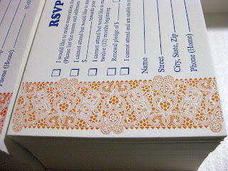
We've been asked once again to supply the Banquet announcements, invitations and RSVPs for the Annual Central Florida Pregnancy Center's November banquet.  This banquet is the major fund raiser for this organisation for the year.  This year proves to be somewhat higher in profile, with Tim Tebow's mom being the guest speaker.  As such, there is a University of Florida connection here, which gave us an idea of the colour scheme that we should consider.  Orange and Blue.


Well, not horribly orange.  We did not wish to be that obvious.  Rather, more of a Pumpkin colour might be suitable . . . after all, it is autumn.  Creating this shade was no mean matter.  It took me close to an hour and a half of trial and error.  Finally, after mixing colours that have nothing to do with orange, and in preposterous proportions, we arrived at the perfect match for a South Alabama pumpkin!


The pattern was borrowed from a lace doily.  The paper chosen was an open fibre variety with enough resiliency to accept a deeper deboss, permitting the un-printed area to 'pop'.  I did this with a business card for a concert pianist some time back, featuring piano keys that raised themselves above the printed level.  I still run my fingers over my sample card.  A little obsessive, yes.  But fun, nonetheless.


Closer observation may reveal that the pattern design is actually triangular, placed side by side in a 'tete-beche' manner, which is anti-parallel.  Even closer scrutiny will bring you to my last installment.  Yes, our friend is none other than the corner design for the blind deboss, re-applied.  Thus, we not only recycle our paper, but our designs, too.


One fine day, I will encounter a camera that will have perspective compensation so these sorts of close-up shots won't have that center truncation effect, but as it is, using my wife's Cannon Power Shot, here is the RSVP.  We could not resist the use of the all time favourite advertising fount of the early 20th Century, good old "Cooper" for the titling.  The rest is Times Roman.


Quite naturally, I have to include several close ups.  Notice that the design actually does not bleed.  It ends just short of the 4-bar sized card.  One reason is that if it was run to bleed, there would necessitate extra cutting, which would imply going under the clamp of the large guillotine cutter.  That would require the ink to stand another 24 hours, and could reduce the "pop" of the deboss.  Perhaps one day I will have a series of cutting dies made.  Yes.  When the Kluge arrives.  What?  Yes, friends, we are expecting the Holy Graille of Letterpresses for our very own, a 10x15 Kluge.  More on that, later.


And now for a few more macro-images, slanted against the light to emphasize the deboss.  You know, this is common to all letterpress photos, really.  Dramatizing the effect in this manner is actually necessary in photo images, otherwise you'd never see the deboss.  I must add, for the sake of my fellow printers: I do not punch hard enough to bruise the obverse of the card's surface.  In fact, if I did, you would see creases in the margins of this close-up.  Open fiber papers need not be driven hard to produce a nice debossing effect.  This helps the longevity of our equipment, which is no longer being manufactured.


They really did come out nice.  This was one fun job to run, I will admit.  The way the lace pops off the edging is really engaging.  I never get tired of looking at it.  In fact, I'm running out of samples, folks I've shown it to wind up, well . . . keeping the samples.  Hmmm . . . .


Here we go, one parting shot from the production table.  We ran five hundred invitations and RSVP cards, which meant over two thousand impressions.  It was a sun-up to sun-down job, when everything was said and done.  Well worth the time.

This pattern, by the way, is available for use with any appropriate invitation and RSVP.  If you think you might find it's use advantageous to your needs, you can refer to it as the Pumpkin Lace design.  I'd call it the Pam Tebow design, but I'm afraid that name has a trademark and copyright on it.  Besides, that would be rather gauche, would it not?


That's all for now.  Stay tuned for more adventures in Letterpress!

-gary.


Monday, August 13, 2012

Combining Work with Pleasure, Installment No. 2


Welcome to installment number two, "Combining Work With Pleasure".  The work: making some of the most awesome cards that rolled off our 1936 New Series C&P Letterpress yet!  Golly, the last month saw awesome calligraphy from a world class Calligrapher, and now we are tripping back to the 1880s with genuine Eastlake tatted borders, bunted frames, and knotted lace.  Look at the blind debossed borders on the finished invitation!  Rebekah wanted some engrossed flourishes around her and Alton's name, so I went back to 1690's Londontown to borrow some penwork from Ayers, which wove nicely into the Script (Bickham Script) and flowed with the inclination and kerning of the characters.


This is the die and print.  The die is courtesy Owosso Graphics, magnesium, wood mounted.  I prefer metal dies over polymer largely owing to the crisp edge nature of metal.  Also, I am a traditionalist.  At one point I will probably start using polymer, but so far I haven't seen the huge advantage it has over traditional wood mounted metal.  As mentioned in the prior installment, the die used for the blind deboss is 16 gauge copper, also wood mounted.


The following shots are close-ups of the invitation and the obverse of the RSVP Post Card.  The ink chosen is straight-out-of-the-tube oil based brown, from "Dave's Ink In Tubes".  What we were not prepared for was the effect of this standard brown against pearl white Lettra: Gold.  Not bright and shiny, but a dense Florentine.  The combination of a debossed image in this colour, the saturation, the shadow cast by the deboss, ever so slight, and overhead lighting produced a remarkable visual!


The deboss of the border was heavy enough: we did not wish to punch the text.  The open fibre nature of Lettra permits the die to sink into the stock's surface just a bit, by its very nature, thus what you have is a nicely planted text line with a solid presence, yet not heavily punched.


A close-up of the flourishes of Mr. Ayers, Scripsit to King Charles II.


Text on the lower part of the Invitation face. 


The use of Postal Card RSVPs is gaining popularity, and the Rebekah / Alton team are no exceptions.  The idea is to save money, both on postage and on having to purchase RSVP envelopes with return addresses.  Much as I'd love to take your money, part of my mission in Letterpress is to make it as affordable for you as possible.  Post Card RSVPs are a great cost-cutting alternative.  The reverse side will be printed as well.


Close-up of the message side.


I used some of the same flourishes as appears on the Invitation.


The border is printed within one thirty-second to one sixty-fourth of an inch to the edge.  It was verrry tricky to feed. While the border carries the same basic design elements of the Invitations, they owe much more to my background in Stamp Collecting (Philately), in that many of the 19th century classic postage stamps used the eyelet lace motife for borders.  In particularly, the Letterpress printed postage stamps.  Proving once again that if you want some great classic design ideas, go to your local Stamp Collector.


Ahh, yes.  The couple, checking out Alton's handiwork, my latest "apprentice". (grin)


"Uhh....doesn't "November" have an "r" at the end of it?"


"Just kidding!!"

Whew!  Don't scare me like that!

And now, set back, grab some pop-corn, and enjoy our latest little vid: Alton Punches Paper with 1200 pounds of iron in motion!


That's it for this installment.  Stay tuned for the next installment, when Alton says "Hmm....I wonder if I can crush pennies. . . . . ?

-gary.