Friday, April 1, 2011

Finishing Touches for the Reception

Boy, "The Time" is coming quickly upon us.  Last month, we ran the invites and the RSVPs with addressed envelopes.  Now, ideas are popping up for what to do for the reception.  A popular item that seems to be getting a lot of press from Victoria and Good Housekeeping, plus State and Regional Wedding Industry publications is the Pulp Drink Coaster.  So I contacted my fav vendor and the artist / bride-to-be.  Two millimeter four inch round coaster blanks were still the same price as they were when I ran my last run of coasters, and Anna determined that her original artwork used for the invitation design could be adapted to her liking, so we did a little digital magic and voila!


These will be reception gifts, banded in groupings of six, which will be placed on the tables at the out-door reception venue at Harmony Gardens, DeLeon Springs, Florida.  Since the wedding colours are teal and coral, I used my original CYMK (read: eyeball) mix formula and made up some custom teal for the coasters to match.  Instead of belly-bands, we are going to tie formal ribbon around each set of six, to give a more lacy and whimsical effect.


Hear is a shot of the coasters, hot off the press.  I ran these on my 1936 Chandler & Price "New Series" platen "job press", which is the perfect press type for coasters such as these.  We discovered that you really don't want to 'punch' pulp-board, that is, you cannot really strike a deep depression, or 'deboss' in pulp board owing to it's naturally short grain, which cracks rather than gives.  However, you can give a nice impression


This photo shows the level of impression that can be had just before the pulp gives way to cracking, which is fairly considerable.  The original artwork was pen and ink on paper, which is perfect for Letterpress because of it's natural high-contrast dynamic.  Pen and Ink illustration and Calligraphy are perfect sources for Letterpress Typography, which is why I always encourage folks who wish to design and illustrate for letterpress to utilise these traditional tools.  The steel nib pen or the quill, india ink, bristol board with a slight polish, Rapidograph pen or the more modern counterparts. 


Here is a close-up of how close I could take the image to the edge without sending a crack.  Pulp is amazingly resilient, so long as you don't broach the cracking point.  I wanted to avoid any bleed because if the image did this, then I would have to use parent sheets, cut the board down to press size, run it, then die cut it.  That is not only hugely time consuming, but it's also not a money saver.  Two millimeter board is not available in parent sheet anyway, so just as well design for availability, and save the client some money.


Here they are, One Thousand Coasters.  Hmm, that sounds like a group of indie buskers down on a St. Augustine street corner!  (Gary is thinking of "One Thousand Portraits", who, with "Waterdown", created some landmark music in the Christian Contemporary Music scene, some of which was picked up by Third Day.)

Well, as Walter Cronkite used to say: "That's the Way it is . . . . "  for 1 April, 2011.  Another press run at G. Johanson, Printer.  Only one more thing I might add: many of you may have checked out my video showing the makeready for the last coaster run from last year.  I did the same thing.  Would you believe that I had no makeready waste?  Everything registered perfectly, centered exactly right, with the very first impression!  Usually, it takes between ten and, depending on the colours used or how many times you have to feed your project through the press, twenty-five percent of your stock to properly set up, ink up and get your impression and registration lined up properly for your run.  And when your stock costs a couple bucks per sheet, that's a lot of waste!  But you MUST use the stock you are going to run, so it's unavoidable.  Using the transparency method really helps me out a lot, and I can transmit that savings to the client! 

Good Providence, fellow Letterpress Artisans, in all your Printing Endeavors!  And to you Brides and Grooms to be, looking forward to that Big Day, I wish you "God Speed".  The best house is always built upon a firm foundation, and the firmest foundation anyone can have is Jesus Himself, Who is abundantly able to carry you safely home.  

God Speed.

Tuesday, February 22, 2011

Another Hornbook Edition in Process!


Ok, it's that time again!  Sufficient orders have been placed to proceed on a new production of the Colonial American Hornbook, part of a series that I initiated back in 1992 at Heirloom Press, Palm Harbor, Florida.  As with each production, or should I say, 'Edition', because these are books, the very first Public School Books on our shores - this one is unique.  Prior editions used various types of Pine, which would have been one of the woods available to the Printer of Massachusetts Bay and Providence Plantation of 1700.  But hardwoods were certainly available, too.  This Edition is Hardwood, stock Poplar.  Nails are cut copper.  Also, we are going one step closer to the original decoupage process: Shellac.  This makes things a bit slower.  Shellac goes on in much thinner layers, and build-up will probably result in more layering, with steel wooling between each layer.  The 'up' side is an interesting and attractive patina.  The downside: more time with steel wool, circle-scrubbing each layer, front and back.

What is remaining the same is the printed face piece, and the cherry stain.  Poplar does not drink in the stain like pine, it rests more on the surface.  This offers the opportunity to 'age' a book by sanding the extreme edges of the wood to bring the lighter wood behind to somewhat show through the stain, creating a time-worn look.  This is a new thing for me, but I like the variety this creates!


The production run on this edition is a bit smaller because the wood available comes in shorter lengths and is more expensive.  In the above photo, three books are drying while the upright one is mounted on it's jig awaiting the next coating of shellac to be brushed on.

That's it for now.  If you wish to know more about the Colonial American Hornbook, America's very first public school "Textbook", you will find a link to my Hornbook FAQs in the links section to the right, and more photos.

Just a reminder: these books are $15.00 each, plus $5.00 postage. If you would like one, drop me a line at wd4nka@aim.com  .  I also usually give notice of upcoming releases on the Letpress List, the Florida Letterpress Yahoo Group, and, of course, here on the blog.  Please allow 2-3 weeks to receive your Hornbook, in that this is about how long it takes to make them and permit the decoupage layers to cure.

Good Providence in all your endeavors!

gary

Wednesday, February 16, 2011

Anna's Announcements

Anna's Wedding Announcements were designed by herself.  The original artwork was in Micron pen, scanned and vectorised.  Colours are Teal and Coral. Paper is 140#/300gsm Canson Watercolor.  The colour is identical to Crane's Pearl White.  All text is 'French Script'.  Two Hundred of these two-colour fold-over A7 announcements and 4-Bar RSVPs ran today, plus the scoring of the A7 card.  No mean feat, it was entirely hand fed on my 8x12 New Series C&P Platen Jobber.  Including the time to wash up between colours, blending the colours (Inks: Daves Inks In Tubes.  Thanks for getting these inks out to me so fast, Dave!!),  and all the makeready typical for a job that passes through the press once for each colour, plus once more for scoring, I was on my feet from eleven in the morning until ten o'clock tonight.


Here is the full set, A7 Fold-over announcement and RSVP card.


A closer look at the RSVP card.


A little detail.  We thought the French Script went well with the airy, whimsical feel of the design.  It is very 'Anna'.


What I love about this card is the cover.  That's Anna and Zac, her fiance.  I think they were sitting on a porch swing.


The interior is my design, actually.  I took part of the flora that Anna drew, and using FreeHand, duplicated it in vector, to create the border, and keep continuity.


A close-up of the border detail. Owosso Graphics, once again, did a superb job with the metal dies used to make this suite.


A close-up of the inside text.  While I allowed for substantial deboss of the illustrations, I opted not to go so deep with the text.  There is still a little deboss, but the letters are very crisp and sharp.  Debossing can interfere with sharpness of image, ink distribution on the die must be carefully monitored.


A closeup of one of the dandelions on the front cover.


....and - a closer look at the front cover design.  Anna's wedding colours will be teal and coral, so we repeated that colour scheme with the Wedding Stationery as well.


Well, that's about it for this installment.  Cards came out great!  Special thanks to Nick and Mama's Sauce for the use of his paper-cutter to cut down the parent sheets.  Your a lifesaver, bro!


Good Providence in all your Letterpress endeavors!


Monday, January 17, 2011

A Special Greeting.


This card is another of Anna's Designs (Anna's Paper Bird), printed on Pearl Lettra in a muted gold oil base, which stands out very nicely, yet is understated.  The card format is A6, approx. 4.75 x 5.75", and includes a matching Pearl White envelope.  Inside is blank.  Anna has designed a few of these whimsical "Robot Cards", but I think this one is my favorite.  The artwork was designed the "Old School" way, pen and ink on a drawing board, scanned at 600 dpi, then vectorized by Inkscape.  Plating was executed by Owosso Graphics.  Hand fed and scored, one by one, on our 1936 Chandler and Price "New Series" 8x12 Letterpress.

These cards are limited edition pieces of original art.


The formal name of my Studio is "Q-5", which is part of G. Johanson, Printer.  The attribution on the reverse of this card is handset in 10pt Sans Serif metal type, the actual font name is yet to be determined.  It was cast by a foundry under contract by Kelsey sometime in the 1940s.  Kelsey was well known for using ATF faces and re-naming them.  For instance, "Marquee" was renamed "Marquery".  But I like the look, so we used it.  I'll let Kelsey and the American Type Founders duke it out over the name. (Both are long gone, anyway.)

We are selling these pieces in sets of five, plus envelopes, for ten dollars ($10.00 USD) per set, plus shipping.

The reason why we are selling these cards, aside from the fact that they are one-of-a-kind examples of both Anna's work and Letterpress Printing - is because they are also serving a very special purpose:

There is a small group of young men in our College & Careers department who are trying to raise money for their mission to Guatemala.  They will be working with a well known ministry to the skate board community in that country.  And in this economy, folks are watching every nickel. Raising funds isn't easy.

This is why Anna and myself have teamed up to help support this endeavor.  All proceeds are directed to the effort to get Jimmy, Mikey, Collin and John down to Guatemala by March.  This is just our own contribution to this missions effort.

The College & Careers group is a ministry of  Deltona Alliance Church, Deltona, FL.

Place orders, or contact me at:  wd4nka@aim.com

Good Providence in all your Endeavors!

-g.


And now for your viewing pleasure and interest, here is Josh doing the honours on our baby C&P!

Tuesday, January 11, 2011

Creating a Custom "Save the Date" Card


It all starts with artwork.  Either I do the artwork or the client.  Or the designer hired by the client.  The artwork must be high-contrast black and white line art, that is, no tonal shading, unless rendered in a high contrast manner, such as cross hatching or stipple shading.  Although I do not recommend it, half-tone photos can work, but Letterpress is not the best venue for photo reproduction.

The artwork is scanned as a black and white image, high contrast, usually around 600 dpi, although I sometimes take the image to 1200 dpi.

After the scan, I bring the resulting .bmp image up in - of all things - Microsoft Paint.  Yessir, good ol' Paint is still one of the best raster level editing programs around for cleaning up high contrast black and white copy for preparation of the next step, which is to take this image and reproduce it in a vector format.

Let's pause for a moment and discuss why this is done.  Years ago when the earth was still cooling, finished artwork was photographed, the negatives of which were then placed over a printing surface which was prepared with a photo sensitized coating.  Ultraviolet radiation exposed this surface through the negative to create a positive image which was then developed, or in the case of a letterpress plate such as zinc, immersed in an acid bath that etched away all non-exposed surfaces, leaving the exposed which is now a raised surface owing to the etching process.  In the case of offset plates, the surface is coated with a developing chemical which adhered to the exposed areas of the plate and coated these areas with an ink-adhering surface.  Correpsondingly, in the case of 'subtractive plates', the chemistry washed away the unexposed surface leaving an ink-adhering surface.

In either case, the point was that a photographic process was used.  If you wanted an image only half the size of the original, you just positioned the artwork twice as far away from the camera lens which reduced the size of the image.  If you wanted only one quarter the original size, you moved the image 75% further from the camera lens, which we called a 75% reduction.  The image was exactly the same as the 100% image, only smaller.  And, inversely, if you wanted an enlargement, you could bring the artwork closer to the camera's 'taking lens'.  This process was in place for over a century.  In fact, my favorite camera to use was a 1922 R&R Robinson 24x24 inch mechanical camera.  And yes, this was my job in the early 1970s.  I shot line images and half-tones for my employer at BKM Press, and for other local magazines (as well as stripping, paste-up, and running our shop's only Letterpress.)

In today's digital world, we use a different process: digital imagery.  We either use high dpi images (dot per inch) which will hold enlargement or reduction to some degree, or we use Vector images.  The nice thing about vector images is that the line is actually plotted on your computer using a mathematical algorithm.  In theory, you should be able to greatly enlarge or reduce a vector image because we are not enlarging or reducing an image based upon individual pixels, which can (and will) distort a re-sized image unless there are so many pixels per inch that the image will retain it's integrity.  There are also filters that will help keep pixel distortion effects to a minimum. You can use a bitmapped image, but the files are (a) huge, and (b), the amount of room you have to enlarge or reduce can be quite limited.  Many designers will use direct Photoshop pixel images, but for me, with a photographic background, naturally tend to go with a process that most resembles what went on when viewed through the ground glass of a 24x24 mechanical camera.

This leaves the latter imaging format, Vector.

Now, to vectorize, you must have a program that will trace a pixel image, interpret it, mathematically assign a position to where to place the 'pointer', or those points that will make up the composite vector line. This can be tricky.  The vector 'engine' has to interpret, first, what a line on the bitmap image even is.  It has to decide which color, black, dark gray, light gray, etc.  to include in the conversion.  Sometimes a the best you can do with the vector conversion process is come up with an image that comes 'close' to the original bitmapped image. But sometimes, close isn't good enough. Thus, on the better vector tracers, there are controls to help the vector engine interpret the way you want it to.  You can tell it, for instance, to produce sharp edges or rounded edges, or to trace each and every pixel - or every five pixels.  It depends on how fine a line, how intricate the design, how minute objects are on the original.  It can some time to arrive at a finished product.  A lot of that time, however, can be reduced by how you handle both the original artwork and how you edit the image at the bitmap level before you attempt vectorization.

One of the most intuitive (which means, something that can make decisions for itself in an accurate manner) vector trace engines is resident on Adobe Illustrator, called "Live Trace".  There are others, which I make reference to later.

After I complete the conversion process and  have a satisfactory vector image, I begin to size it according to my needs, which means I either work with the image on the vector IDE (Inter-Developmental Environment, if you want the fifty-cent term for a computer drawing board), or import that file to another IDE to do this.  I do both, depending.


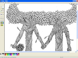
This is a screen-shot of the artwork, produced by Anna Johanson, of "Anna's Paper Bird".  The original art was created on bristol white, in fine point calligraphic marker.  My task here is to remove more leaves in the center of the treetops to make more room for text.  Anna could have done this at the drawing board by re-drawing the image, but that is unnecessary. I can do this type of editing with Paint in 'zoom' mode. Most of the editing done on copy-work such as this is done at the bitmap, or raster level.  When editing is completed, the file is saved to either a .gif or .jpg file.  The original .bmp file is also saved as the work file for future use.  Of course, this is an example of editing at the bitmap level, before vectorizing.  I could do some of this after vectorizing on the vector IDE, but for me it's just easier to do it at this point.  When I am satisfied, I then inport this file to a program which will trace this image and convert it to vector.  Because I've done this for a while, I can pretty much tell that this particualr image will vector very nicely.


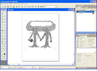
This is a screen-shot of the completed vector 'work' image as viewed from my trusty MacroMedia FreeHand  2004MX IDE . I could have also used my Mac, which has Adobe Illustrator CS-4, but I usually wind up using that for either extremely complex multi-path vector tracing using Illustrator's "Live Trace" vector engine, or if I absolutely must save a ' .ai ' file.  Some platers require Illustrator .ai files, but my plater of choice, Owosso Graphics, still accepts FreeHand, which I feel to be still the most intuitive and fastest vector IDE around.  Adobe had rocks in their head when they decided to drop FreeHand for Illustrator, but I digress.....

In this particular case, I used yet another vector engine, one of the best I've found outside of LiveTrace: InkScape, which is a free share-ware program.  Yeah, I'm giving away all my secrets.  Nobody ever said I was a very good businessman.  But for fairly non complex vector traces, InkScape does a very nice job, once you learn the limits.  Inkscape works on a PC, which is where I have FreeHand, so it's just easier for me to pass image files back and forth on the same computer than sending it over to a Mac.  In my Studio/Shop, what's started on PC - stays on PC (if I can help it), and what's started on Mac - stays on Mac.  It's safer that way.

Inkscape can save a file to several different formats.  My preference is .pdf, which shakes hands with FreeHand better than .eps (encapsulated postscript).  Vector images saved in 'cairo' .pdf opens up directly in most cases.  


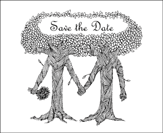
Once I have the "document" sized to the finished paper size (in Illustrator, this would be the 'artboard'), I place my image where I want it.  Sometimes I have to re-size the image to fit the intended purpose.  In this case, I re-size the original image to about 70%, and center to the sheet.  Then I choose the font I wish to use for the text.  The choice of fonts can take some time for me.  I must see it work with the image.  In this case, we settled on French Script.  If you look at the top of the screen, you can see one of the other choices, Lombardy, which was a bit too medieval for the whimsical nature of the illustration.  Anna liked the flow of the French Script.  And remember: the designer knows best.  Next to the client, of course!


Once the image is completed, I save either a .jpg or a .gif image, along with the native .fh11 FreeHand file, or in the case of Illustrator, the .ai file.  It is the vector file that is sent to the plater.  I also send one of the raster images as well, just in case the vector files does not open completely at the destination to where I sent it.  The .jpg or .gif file will let the recipient know exactly what the finished image should look like.  I also send the raster images to the client or designer for approval / corrections.  I always send images at 100% copy size.  This helps for cases where registration may be necessary.  Before any vector containing text is sent, all text must be converted to image (in Illustrator, the terminology is different.  I think its convert to outline or contour, or something like that.) - which converts text into....well....an image!  This means that instead of the recipient needing to have the exact same font available on their computer to correctly view the image and text, the text appears as a non-text image, not requiring the use of any font at all!  When you convert to line or convert to image, the program preserves the individual letters and characters as a vector outline, perfectly reproducing the original letters. This ensures the finished product is viewed exactly the way you want it viewed.


This is the inner fold portion of the Save the Date card,  which also uses French Script, with a little Edwardian at the bottom.  Those florals on the bottom corners come courtesy of the old Deberny Engraving company (Deberny et Cie) of Paris, France.  This fine old company produced printers' cuts for commercial use during the 19th and early 20th century.  These particular cuts were originally wood engravings from approximately 1880.
Well, this is how it's done, folks.  After about a week, I receive the cuts from my plater (Owosso Graphics)  unless I express them.  Owosso Graphics can produce magnesium or copper cuts in around 24 hours if you have to do something very quickly, but by my studio and shop policy, I don't rush Letterpress jobs.  Letterpress printing is a hand wrought, labor intensive process that does not work well with speed.  BTW, apart from being very happy with their product, I have no connection with that company, neither do I receive any pecuniary remuneration or consideration.  Just calling good work where I see it.

. . . and as you may guess, the next step is the cutting of the stock and the printing of the order.

Hope this installment helps to shed some light on the aspect of the design process.  I did not shoot every  single portion of the process, just the main phases.  Sometimes the prep work and digital imagery required after the artwork is completed takes as long to accomplish as the artwork itself! 

Good Providence in all your Letterpress Endeavors!  And a Happy New Year to You All!

-gary

Tuesday, November 30, 2010

Who's That Patient?

These are actually game-piece cards used for training purposes.  I was asked to print some, and since I had the stock, a few border fonts, and an idle Press is the Devil's Play-tool, I thought "why not?" . . . and hence my latest piece of ephemera emanating from the Press of G. Johanson, Printer.  The obverse is the name of an optical product, digitally printed.  The reverse is a two colour rosette pattern and Text.  It reads "W.T.B., with a question mark centered beneath, set in 36p. Cooper Black from Quaker City Foundry, who now supplies Colonial Williamsburg.  They have been supplying me with foundry type since 1991.


Each deck contains the name of fifteen products, such as "Drill Mount", "No Glare", "Care Kit", & etc., with a title card that reads "Who's That Patient?" Total press run was forty-five.  Total with makeready impressions and registry set: 85.  Not a bad ratio!


The yellow pattern on the reverse was formed by nearly my whole font of 18pt Rosettes.  I custom blended the oil based process yellow with opaque white at around 15:1.  The pattern is very understated.  I just wanted to hint that it was there.  The white photo light really picks it up.


Here's a close-up.  The paper is a natural white linen finished 70 lb stock, which is quite hard.  Unlike Lettra and the open fibre papers, you really don't want to punch the impression much.  It shows on the backside, and you need that flat for the obverse print.


Another zoom-in shot.  I've had these Rosettes for years.  Actually, they are the Traditional English Rose borders that go back to the 17th Century.  Like me.


Nice thing about geometric patterns is that you can use them as a sort of grid with which to align your text, if you happen to be using it as a back-drop.


Here is a shot of my New Series Chandler & Price 8x12 motorised platen press.  Obviously, this is the black forme and print.


Just in case my client wants more . . . or I somehow mis-understood the order, which was taken down more or less in a rush - I decided to keep the pattern and text formes intact until I am certain I will not be needing it anytime soon.


A close-up of the Forme.  Those darker Rosettes are from my earliest sort from QC.  I've since added one more sort to build up the inventory.


This is the composing position in my Shop.  To the left are "tie-ups", formes on galley trays, and to the extreme right is my towering type cabinet.


Yup. Eighty-five total impressions.  The ol' brass counter don't lie.  Well . . . yes, it can. 

So, what's next on the docket?  Still thinking about doing a publication, gang!  But first I need to build up more inventory.  Like a 22" Challenge cutter!

So . . . that's it for now.  Top o' th' Season to Ye, and good Providence in all your Endeavours, Letterpress or Otherwise!

-gary.

Tuesday, September 28, 2010

Getting Ready for the Holidays!

Well, here we go, getting ready for the Holidays all over again. Today I thought I might start off by printing Christmas tags. These are larger tags, 4 x 1.5 inches, almost bookmark size. They can serve as a gift tag . . . or a micro-Christmas card. The perfect thing to slide under a windshield wiper or in a door jam or any place where you might wish to slip a discrete Christmas greeting. Or . . . use it for a large gift. I like to use this sort of thing to accompany a tip at a restaurant. These will be banded in quantities of ten.


The text is set in 30 point Chaucerian Black Letter. The Holly border font came from Quaker City. The Blackletter font is about fifty years old. Possibly older. Colour is process red, oil base, and process green, rubber base. Paper stock is 110 lb cotton rag (Crane Lettra.) You might be able to see from the photo how nicely this open fibre stock gives way under the pressure of the impression, leaving a nice debossed print. Ahh, classic Letterpress!

These are limited quantity. While these are being produced for friends and family, I will make the remainder available for purchase if anyone is interested. Just e-mail me at wd4nka@aim.com for pricing. I promise a hard to beat price for a two colour hand crafted Letterpress Item.

That's it for this installment. Short and sweet.

Good Providence in all your Letterpress Endeavours!

-gary

G. Johanson, Printer.