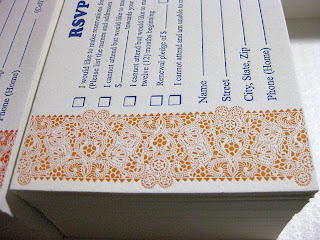
We've been asked once again to supply the Banquet announcements, invitations and RSVPs for the Annual Central Florida Pregnancy Center's November banquet. This banquet is the major fund raiser for this organisation for the year. This year proves to be somewhat higher in profile, with Tim Tebow's mom being the guest speaker. As such, there is a University of Florida connection here, which gave us an idea of the colour scheme that we should consider. Orange and Blue.
Well, not horribly orange. We did not wish to be that obvious. Rather, more of a Pumpkin colour might be suitable . . . after all, it is autumn. Creating this shade was no mean matter. It took me close to an hour and a half of trial and error. Finally, after mixing colours that have nothing to do with orange, and in preposterous proportions, we arrived at the perfect match for a South Alabama pumpkin!
The pattern was borrowed from a lace doily. The paper chosen was an open fibre variety with enough resiliency to accept a deeper deboss, permitting the un-printed area to 'pop'. I did this with a business card for a concert pianist some time back, featuring piano keys that raised themselves above the printed level. I still run my fingers over my sample card. A little obsessive, yes. But fun, nonetheless.
Closer observation may reveal that the pattern design is actually triangular, placed side by side in a 'tete-beche' manner, which is anti-parallel. Even closer scrutiny will bring you to my last installment. Yes, our friend is none other than the corner design for the blind deboss, re-applied. Thus, we not only recycle our paper, but our designs, too.
One fine day, I will encounter a camera that will have perspective compensation so these sorts of close-up shots won't have that center truncation effect, but as it is, using my wife's Cannon Power Shot, here is the RSVP. We could not resist the use of the all time favourite advertising fount of the early 20th Century, good old "Cooper" for the titling. The rest is Times Roman.
Quite naturally, I have to include several close ups. Notice that the design actually does not bleed. It ends just short of the 4-bar sized card. One reason is that if it was run to bleed, there would necessitate extra cutting, which would imply going under the clamp of the large guillotine cutter. That would require the ink to stand another 24 hours, and could reduce the "pop" of the deboss. Perhaps one day I will have a series of cutting dies made. Yes. When the Kluge arrives. What? Yes, friends, we are expecting the Holy Graille of Letterpresses for our very own, a 10x15 Kluge. More on that, later.
And now for a few more macro-images, slanted against the light to emphasize the deboss. You know, this is common to all letterpress photos, really. Dramatizing the effect in this manner is actually necessary in photo images, otherwise you'd never see the deboss. I must add, for the sake of my fellow printers: I do not punch hard enough to bruise the obverse of the card's surface. In fact, if I did, you would see creases in the margins of this close-up. Open fiber papers need not be driven hard to produce a nice debossing effect. This helps the longevity of our equipment, which is no longer being manufactured.
They really did come out nice. This was one fun job to run, I will admit. The way the lace pops off the edging is really engaging. I never get tired of looking at it. In fact, I'm running out of samples, folks I've shown it to wind up, well . . . keeping the samples. Hmmm . . . .
Here we go, one parting shot from the production table. We ran five hundred invitations and RSVP cards, which meant over two thousand impressions. It was a sun-up to sun-down job, when everything was said and done. Well worth the time.
This pattern, by the way, is available for use with any appropriate invitation and RSVP. If you think you might find it's use advantageous to your needs, you can refer to it as the Pumpkin Lace design. I'd call it the Pam Tebow design, but I'm afraid that name has a trademark and copyright on it. Besides, that would be rather gauche, would it not?
That's all for now. Stay tuned for more adventures in Letterpress!
-gary.


