Welcome to installment number two, "Combining Work With Pleasure". The work: making some of the most awesome cards that rolled off our 1936 New Series C&P Letterpress yet! Golly, the last month saw awesome calligraphy from a world class Calligrapher, and now we are tripping back to the 1880s with genuine Eastlake tatted borders, bunted frames, and knotted lace. Look at the blind debossed borders on the finished invitation! Rebekah wanted some engrossed flourishes around her and Alton's name, so I went back to 1690's Londontown to borrow some penwork from Ayers, which wove nicely into the Script (Bickham Script) and flowed with the inclination and kerning of the characters.
This is the die and print. The die is courtesy Owosso Graphics, magnesium, wood mounted. I prefer metal dies over polymer largely owing to the crisp edge nature of metal. Also, I am a traditionalist. At one point I will probably start using polymer, but so far I haven't seen the huge advantage it has over traditional wood mounted metal. As mentioned in the prior installment, the die used for the blind deboss is 16 gauge copper, also wood mounted.
The following shots are close-ups of the invitation and the obverse of the RSVP Post Card. The ink chosen is straight-out-of-the-tube oil based brown, from "Dave's Ink In Tubes". What we were not prepared for was the effect of this standard brown against pearl white Lettra: Gold. Not bright and shiny, but a dense Florentine. The combination of a debossed image in this colour, the saturation, the shadow cast by the deboss, ever so slight, and overhead lighting produced a remarkable visual!
The deboss of the border was heavy enough: we did not wish to punch the text. The open fibre nature of Lettra permits the die to sink into the stock's surface just a bit, by its very nature, thus what you have is a nicely planted text line with a solid presence, yet not heavily punched.
A close-up of the flourishes of Mr. Ayers, Scripsit to King Charles II.
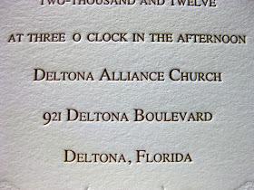
Text on the lower part of the Invitation face.
The use of Postal Card RSVPs is gaining popularity, and the Rebekah / Alton team are no exceptions. The idea is to save money, both on postage and on having to purchase RSVP envelopes with return addresses. Much as I'd love to take your money, part of my mission in Letterpress is to make it as affordable for you as possible. Post Card RSVPs are a great cost-cutting alternative. The reverse side will be printed as well.
Close-up of the message side.
I used some of the same flourishes as appears on the Invitation.
The border is printed within one thirty-second to one sixty-fourth of an inch to the edge. It was verrry tricky to feed. While the border carries the same basic design elements of the Invitations, they owe much more to my background in Stamp Collecting (Philately), in that many of the 19th century classic postage stamps used the eyelet lace motife for borders. In particularly, the Letterpress printed postage stamps. Proving once again that if you want some great classic design ideas, go to your local Stamp Collector.
Ahh, yes. The couple, checking out Alton's handiwork, my latest "apprentice". (grin)
"Uhh....doesn't "November" have an "r" at the end of it?"
"Just kidding!!"
Whew! Don't scare me like that!
And now, set back, grab some pop-corn, and enjoy our latest little vid: Alton Punches Paper with 1200 pounds of iron in motion!
That's it for this installment. Stay tuned for the next installment, when Alton says "Hmm....I wonder if I can crush pennies. . . . . ?
-gary.


Lovely work, did you use die's for all the pieces?
ReplyDeleteThose invitations are magnificent! With all those little details, the process must take you a considerable length of time?
ReplyDeletePat: yes, each piece required separate dies. Two for the invitation (one for the blind deboss, one for the text) and one for the RSVP.
ReplyDeleteTinten: Yes, the process can be extremely labour intensive. The ink mixing, the pressure adjustment, the hand feeding, pausing every hundred impressions to add ink, and then, during the run, each sheet you print needs to be looked at, monitored for problems that may develop during the run, such things as a part of the die suddenly ghosting, or receiving too much ink, in which case the press must be stopped and rails raised or lowered, the die must be 'built out' or the packing behind the tympan must be adjusted. Suddenly the wood backing the die may compress by a few thousandths of an inch, or hundredths of a millimetre, which must be compensated for. Thus, the intensity of operator involvement is sustained through all parts of the process. Oh, and we haven't even gotten to the bindary aspects yet!! :)
In my shop, there are no auto-feeders, no Heidelberg Windmills, no labour saving devices. Save for using a computer vector programme to help (help...not create, but help create) with the artwork, my shop might represent the state of the printing art circa 1870 - 1900. Except, I don't have a Linotype. (grin)