Pages

Thursday, December 13, 2012

"Dala Horse" Holiday Drink Coasters.


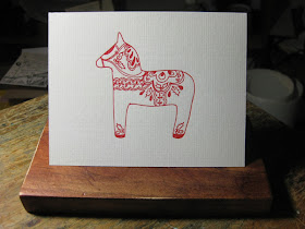
Our new Holiday Coasters!  The design is non other than the Swedish "Dala Hesten", or "Dala Horse".  This design was originally created by Anna Coleman for her own personal Christmas Cards (see last installment), but we couldn't resist setting up a holly border from our foundry metal type collection, surround the horse with it, and printing  it on 2.0 mm thick square coaster stock.  We think it turned out nicely.


Each card is individually hand fed twice, one for each colour.  Since this is a hard surface pulp stock, special measures had to be taken in order to effectively print upon it, leaving a suitable impression and deboss, without cracking the board.  The solution was to expose each card to steam before impression.  Each card had to be held over rising steam, which provided just enough dampness to create a nice transfer of ink from the metal die - to the coaster.  No machine does this.  It must be done by hand, under a careful and watchful eye.


This is a bit of a close-up, showing the cast holly border with corner bells.  If you are reading about Anna's Dala Horse design for the first time, I go into it in greater detail on my last posting on this blog, covering Anna's Christmas Card design.


These coasters will be sold in sets of ten from our Etsy Shop.  If you have not visited our shop, stop on by.  We've only just started Etsy, so we have only our Christmas Card and Dala Horse Coaster set available to date.  Take advantage of direct on-line purchasing through our on-line store!


I would like to point out that the Dala Horse is not simply a "Christmas" Horse!  The Dala Horse is a year-round display of Swedish Folk Art.  The coasters you see are displayed in a Christmas Seasonal display, but they can be used the whole winter season long.  They are not necessarily a Christmas design, rather, what I might call a "winter" design, or an ethnic Swedish design.

Well, that's what is new here at G. Johanson, Letterpress.  Best of Providence in all your Christmas Endeavors!

-gary

Monday, November 26, 2012

Anna's Dala Horse


My daughter, designer/artist Anna Coleman, decided to go simple, almost minimalist with her Christmas Cards for this Holidy Season.  Her subject: the Dala Horse.

My father's half of the family came to this country around 1900.  They came from the Nora District, not far from where these wooden horses are made.  Our home has always had at least two to three of these horses.  

A Dala Horse has a history dating back at least to 1800, some historians crediting soldiers, who at the time were quartered in private homes in this district, for the first of these horses.  They were carved in their spare time and given as gifts to their residential hosts.  More than likely, they were given to the kids, but in time, they became replicated by the local woodsmiths, where they became part of the folk art of the region.


A Dala Horse is actually a very primitively cut horse design, carved from a block of wood, usually some sort of ash or poplar.  Perhaps clear, dried pine or spruce.  They are given a base colouring, usually either orange, white, blue, and even yellow and black.  Then the decorations are applied in a manner not unlike tole painting.  When dried, the horses are heavily lacquered. 


Anna's Christmas card is printed in a "Brick Red" oil based ink.  They are single coloured, without text, both within and without.  The stock used is Neenah Classic Laid light grey card stock.  Size is 4.25 x 5.5 inches (A2, fold-over).  She ran these as a Limited Edition. Anna is still deciding on package quantity and prices.  When this is determined, I will post these cards on Etsy.

That's it for now.  I might add that Anna actually printed these herself, from my own home Studio/ Shop press.  She also did the fold scoring.  Dad helped.

Good Providence in all your Holiday/ Christmas endeavors!


-gary.

Sunday, November 25, 2012

Grand Opening! G. Johanson, Letterpress has an Etsy Shop!


Hi, Folks!  I hope you had a great Thanksgiving.  I know I sure did!

It's a milestone for us at G. Johanson, Letterpress.  It is also part of a strategy to get our shop out there in the public eye on a shoestring budget.  Since I do not have a "brick and mortar" store - and it may be some time before I can become one - Etsy will do.   Since our work has been entirely commission business, there is not a lot of what one might call "product".  I have the Christmas Card.  

That's it.

But it's a start.  You can visit it by clicking here.

I also provide a link on the right hand side "Links Within and Without" section.

I hope to feature more product as I can produce them.  But you will always have a head's up first on this blog, because this is where all the cool behind the scenes stories are!

Thanks for visiting, and if you want some cool limited edition Christmas Greeting cards that speak to the Old World, and are real limited edition prints, I am set up for direct on-line payment.

Top o'th' Holidays to you all, and Good Providence in your upcoming Celebrations!

Monday, November 19, 2012

Limited Edition Christmas Cards: "Christmastide 2012"


As a tradition, G. Johanson, Letterpress,  has always looked to the "Old World" during Christmastime for ideas in graphic design.  My art background is rooted in Germany, where I took my first steps in the Arts, both in Calligraphy, Printmaking, and Music.  Surrounded by over a millenia of culture,  600 years of printmaking, lettering, bookmaking, I lived and breathed the examples of this amazing art set before me.  In particular  I fell in love with the Woodcut.  

This year, I sought to carry this Old World Spirit of the Season in our Christmas Cards for 2012.  For this year's offering, we honour the Nativity and the Legend of the Three Kings with an illustration from the book "Legend of the Holy Three Kings".  Just how "Holy" the Magi, who were in fact Zoarastrians, actually were,   might be in doubt, but there is no doubt that these priests were, in their land, called the "King Makers".  What they presented to Jesus  when they finally found Him - following the prophesies of the Torah and their own understanding of the Star map - were the very same gifts they would present during the inauguration of their own rulers.  They were, in fact, pronouncing Jesus as King.  This is why the visit of the Magi was so remarkable.  And this remarkable-ness was not lost upon King Herod, desperately seeking to secure his own Throne.  This was why the Magi stopped by Herod's palace: they qualified as a Diplomatic legation.  Their's was not a simple interest visit.  


This cut shows the Magi presenting the King with the specified gifts of gold, frankincense, and myrrh. The official capacity in which these priests presented themselves was not only indicated by their gifts, but in the way they presented themselves.  They were beholding, in their estimation, a genuine King.  

Above is a close-up of the metal die, adapted from the original cut, cast in magnesium by Owosso graphics to my specifications.


I love the way a metal die looks before ink is applied.  What you are viewing here is the black, or "key" die, which serves as the primary registration device.  The die is wood mounted. Three dies were used in the production of this card, plus the handset "Colophon" on the reverse.  The inside area is left blank.  


Here is the finished result.  These are A2 sized (4.25 x 5.5 in.) printed on a very elegant off-white stock that has the look and feel of handmade paper.  The envelopes are matching.


The image is obviously from antiquity: the Adoration of the Magi, from "The Legend of the Holy Three Kings", a woodcut illustration from the book printed in Modena, Italy, dating 1490.  Two years before Columbus set sail!   The verse surrounding the image comes from the King James Authorised version, the angelic announcement to the shepherds.  Maltese crosses adorn the corners.


The text on the back of the card is Caslon OS 337, the very same font that serves Colonial Williamsburg, cast from the same foundry.


The Legend is printed in Gold oil base.  All my inks are flax-seed based ink.  This particular gold is Van Son specialty ink, which cost a small fortune.  Very nearly $80.00 per pound.  But oh, is it nice.  


The original image had what appears to be burrs on the outer border line.  The lines are not exactly parallel.  It was cut purely by eye, 512 years ago, possibly with a straight edge knife.  I had the option of cleaning up and straightening the lines, but I resisted this temptation.  This is a hand wrought work of art in it's originality, and I wanted to preserve that feel as much as possible.  These are never to be seen as flaws.  


"Christmastide" is an old term, referring to the period between Nativity to Epiphany, alternately, Heilig Drei Könige, or Three Kings Day.  It's the same as "Yuletide".  Unlike the typical American celebration of the Day, my background culture calls for the celebration of the Season.  


G. Johanson Letterpress plans to add to this edition each Christmastide, featuring a traditional woodcut typical of the Incunabula period of printing and bookmaking.  These will be limited edition, each edition limited to 200 prints.  There may be two editions per year depending upon demand.  At this point, I have printed only one edition of these cards.


If you are interested in purchasing these cards while available, (and take advantage of direct on-line payment!)  visit my new Etsy Shop by clicking here.

That's it for now.  Stay tuned for our next installment!  And the very best of the Thanksgiving Season to you all, from Gary and Staff at G. Johanson, Letterpress!


Monday, October 29, 2012

Isabel's Open House!


Some of you may recall the installment on this blog, where I hosted a one-on-one workshop with Isabel, chief cook and bottle washer for 9th Letter Press, who recently held an open house on their premises in Winter Park, Florida.  Isabel is a talented artist / artisan, designing her own stationery, printing commissioned items as well, such as wedding announcements and other ephemera.  Her location is just three blocks shy of Fairbanks, on Orange Avenue.  In fact, not far from the birthplace of both Rifle Paper Co. and Mama's Sauce.  Right where I lived as a high-schooler, and on the same road where I found my first job in the Printing Biz, Robinson Press, forty years ago.


There were many in attendance, and among the fellowship of local print artisans were educators, calligraphers, Anna & Nate from Rifle, Sarah from Bella Figura, her mom, who is a fellow calligrapher.  In fact, I spent almost half my time talking to Sarah's parents.  Also there were Isabel and Sheli's family.


Cecilia, Isabel's mother, is responsible for the awesome hors d'oevres, show in these photos.  I spent a considerable time in conversation with Isabel's parents (as her former instructor, I had to give them their kid's report card, y'know!)


Cecilia, if you're reading this: next time you come a'baking, and I find out about it, I'm there!!  You can cater my open house any day of the week!  See these pumpkin cupcakes?  Tooo dye for!


This 110 year old Iron Horse is "St. Peter", guardian of the Shop.  He is an 1890s vintage Chandler & Price "Old Series" 10x15 platen "job" press, which does literally all of Isabel's impressions.  We worked on her from out of Isabel's garage for a time, bringing her into serviceable condition.  That was a story in and of itself!  St Peter is powered by a 1/2 horse Marathon Farm Motor (just like my New Series 10x15, soon to become property of yet another Letterpress Studio in Land o' Lakes, Melissa, of Creative Brainbuzz/)  


I must say, there had to be at least 250 people both inside the studio, and overflowing out into the parking area where tables were set up.  My goal last night was to master the art of 'strategic standing', so as not to get in anybody's way.


Ah, yes.  Let's see: White and Red Zinfandel (?), South Hampton Pumpkin Ale - that was surprisingly good, plus another brew on pump, seemed to be an IPA of some type.  The center dispenser has Harry Potter's Pumpking Juice.  Beverage to Spike the Nite for our Delight!  - with due paraphrase apologies to J.R.R. Tolkien


Several trips to and fro the snacks, the beverages, the conversation, meeting faces again, and for the first time, hugging necks, meeting spouses, it was a great event.  I was glad our local resident hurricane Sandy decided to blow out, and drop down excellent weather for the evening.


I think I was the only one that came in blue jeans and flannel shirt.  I'm a little too laid back to get into the suit and tie gig, although my sweet wife informs, that I had better start imbibing said 'gig'.  I might be putting one of these things on myself soon.  Yeah.  I'll have Avett Brothers do the music, too!


Do some of the imagery seem blurred and out of focus?  Yes, there was quite a bit of activity, even out in the parking lot.  Folks just seemed to keep coming in!  Pretty good, considering about half of the mailed invites got lost in the mail, never delivered!!  We think it may have been due to the gold metallic finish on the mailing envelopes that could have confused the mail scanners.  Something to think about when choosing an envelope finish, btw! 


Our parting shot for the evening will be of this amazing little mobile caterer, the name of whom I absolutely forgot!  When I find out, I'll post their names.  They make Crepes!  Any kind, you name it, and right from the truck.  Super friendly folks, average cost was about six bucks.  For a nice filled crepe, you can't touch that at a Creperie, believe me!

We here at G. Johanson, Letterpress - meaning me, my wife, and designer daughter Anna Coleman (who works at Rifle Paper Co. btw!) wishes every good blessing and all that Providence will provide, for Isabel,   Sheli and Staff at 9th Letter Press.  I am proud to count you among my friends, fellow artisans, and co-conspirators in the Black Arts!

May ascribing a proper description of our Creator in everything we design and print be our goal and purpose, a tradition and purpose handed down from Herr Gutenberg himself.  Sola Deo Gloria!

-gary.

Tuesday, October 23, 2012

Getting Melissa's Press Ready!


Melissa will be picking up her 1916 Chandler & Price 10x15 New Series Platen Job Press soon.  What needed to be done to it was mainly making it operable.  It needed a new motor and belt, a switch, switch wiring, motor wiring, new front and swivel boards, and a de-gunked ink fountain.  She also needed two new 2x8 boards to rest upon.  I wanted to give Melissa a preview of the press, now that it's ready to roll.  Here goes!


The first group of photos shows the ink fountain which had to be disassembled, cleaned, the ink blade scraped and "sanded".  Then, with cleared oil ports, it was put back together and bolted upon the press.  All petcocks turn easy.


1.


2.


3.


4.


5.


6.


7.


8.


9.


10.


11.


12.


Amazing how a photo changes with the addition of a flash!

The next grouping is the press set-up.


I installed a 'safety switch' to provide easy and quick operation.


The switch is bolted on the left hand under-side of the front feed board.


The motor is a 1/2 hp Marathon 1725 rpm Farm Motor, sporting a 1" pulley for the 'v' belt.  This provides a cycling speed of one impression every 2.5 - 3 seconds.  It can be slowed by belting direct to the shaft.  Notice that the motor is wired to a female outlet.  The switch actually controls the outlet, rather than the motor.  You can see the steel shielded "extension cord" plugged into the outlet.  The power is switched here, rather than the motor.  I wired it this way for ease of installation.  The motor and outlet stay together, with the switch wiring hardwired into the top of the outlet box.  The box is then literally plugged into a standard wall outlet.


These are the new boards, both cut from  furniture grade birch ply.  Aluminium channeling edge the front and rear of each board.  These are cut to the original boards' dimensions.  The original boards - also ply - had delaminated over the past 96 years. 


The ink fountain is re-mounted.  This is the original "full" fountain that came with this press.  Also included is the original motor bracket holding the original 1916 Kimble motor, which works, but really should be rebuilt.  I managed to find the original leather belt.  I do not know if the original belt actually has the integrity to power the press, it's pretty dry, but it can still serve as a 'sizer' and model for a new one, should the new owner decide to actually rebuild the motor.


Here is a view behind the press, showing the motor, the outlet, the switch wiring and the plug-in power cable.


. . . and, of course, the power cable is plugged into an outlet.  I have enough cabling to travel a considerable distance, should the press need to be place a considerable distance from the nearest available wall outlet.


And finally, an added plus!  I located a pair of stock gripper bars, or "frisket bars" which may have been the original grippers for this press.  This press had spent some time on the loading dock at Mama's Sauce, next to a Kluge and a Heidelberg, and the associated hardware for all these presses were scattered hither and yon.  Joey at Mama's Sauce [Ed. note: thanks for the correction Nick!], let me poke around to hunt down the missing hardware for this press as I was in the process of re-habbing her.  This was when I located the leather belt.  The grippers were not together, but they are mirror matches of each other.

Just a side note: this press also came with a chase, which is 'stone' level, and fits the type bed easily.  This was important because ease of fit is not always the case.  I think the chase is original to the press as well.

She runs well.  There is a video of her in operation up on YouTube already.

That's it for now.  BTW, the press is already skidded for easy fork-lifting, Melissa, so it should be an easy pick-up.  I also have a set of come-alongs to tie her off in your moving truck. 

-gary