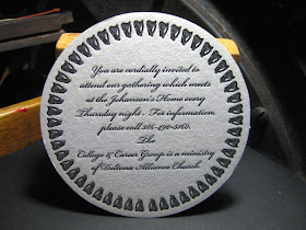
The finished product! Turned out better than we, the staff at Q5 dared hope! So, while we're all slapping each other on the back and lighting each others' celebratory Black & Milds (wood tipped for that extra dose of erudition), let's take a look at some of the distinctions that make Letterpress and Drink Coasters such as these unique. For one thing, most beer-mats and other pulpwood compressed fibre coasters are printed offset and die cut. Great for speed and maybe even keeping costs down to a dull roar, but the surface of the product remains boringly flat. And while the mass produced coasters may have four and five colour process, those colours tend to be less than striking. Oh, don't get me wrong, as a huge fan of Beer Coaster art, I've seen wonderful coaster designs, but very, very few that rise to the level of "striking".

With Letterpress Typography, there is a visceral contact of the metal plate against the printed surface, particularly with pulp coasters. This contact pressure leaves an emboss which is not only visible and touchable . . . but quite aesthetically pleasing to behold. Note the wood engraving which is the central image has recessed, or "sunk" into the coaster. The brown circle is debossed into the coaster as well, leaving the letters to "rise", or emboss. You don't get that with mass produced offset products. And for you other letterpress printers, note that the pressures needed to produce these effects with coaster stock is in no way unusual or dangerous to the press or dies. Coaster stock is fairly soft and gives. I never stress my presses!

Here's the other coaster. The coaster is correctly positioned straight up: the balloon is at an angle because it is in flight. The detail of the engraving is superb, all the way down to the weave of the basket of the gondola, the sandbags, and the pilot pointing down to the earth below. These dies are the excellent work of our partners in crime, Owosso Graphics, the exclusive plate and die makers for Q5.
Join us in viewing the final wrap-up video of "The Run". From makeready to stacking the finished product for overnight drying, this project took about eighteen consecutive hours to print. As you view the video, you will note that the impression is taken every second cycle of the press, that is, you will see the "clamshell" platen close twice for every one inked impression. This is called "Double Rolling", and is a technique used to provide superior spread of ink over large, unbroken areas of colour such as the colour ring of the coaster. This, effectively, doubles the printing time.
I might note at this time that the brown ink is of particular note. It was purchased in quarter pound tubes from the Kelsey Company in 1980. The ink is thirty years old! It was as fresh as if it were brand new. The colour was a deep, rich chocolate. I couldn't have asked for better. And rest assured, my future ink purchases will be in tubes!
The music that you will hear in the background of the video is from Beirut (the band, not the Country!) - part of the music line-up in the Shop, including Ingrid Michelson, Iron & Wine, Sufjan Stevens, Tallest Man on Earth, Band Marino, etc.
. . . we're an "Indie" shop, after all!
. . . we're an "Indie" shop, after all!
Well, that's about it for now. Hope you've enjoyed going over the Coaster Project half as much as we've enjoyed making them. And note that Q5 can make these for order as well. Interested parties should contact gary, chief cook & bottle-washer at: wd4nka@aim.com
Good Providence in all your Letterpress Endeavours!
-gary.
--.- // .....


